

Personalised Medicine Needs More Than a Print Button
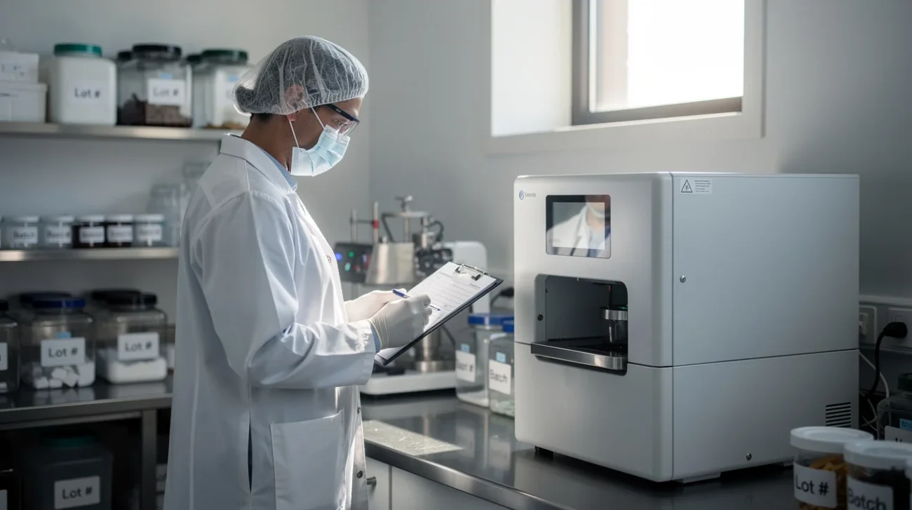
A print button is an excellent symbol of convenience and a poor symbol of clinical responsibility. Patient-specific medicine demands more than producing the right-looking object: someone must establish that the formulation, dose and preparation process are appropriate for a particular person. The design challenge is not to eliminate that responsibility, but to give it better tools.
Studio Aslak Siimes has unveiled CurifyLabs’ PharmaPrinter Aurum, a pharmaceutical compounding system designed to improve the creation of patient-specific medicine, according to Dezeen’s November 2026 report. Its ambition to “empower pharmacists” deserves attention—and interrogation. The supplied source summary establishes that ambition, not the details of its interface, validation procedures or safeguards. The arguments below therefore distinguish the opportunity from the design requirements such a system should meet. This is not a clinical assessment of Aurum.
PRO: Automate the Repetition, Not the Reasoning
Personalisation sounds luxurious until it becomes necessary. A child may need a dose unavailable in a standard commercial presentation. A patient with swallowing difficulties may require an appropriate alternative dosage form. Someone with a documented excipient sensitivity may need a different formulation. These are examples of why individualised preparation matters, not claims about which treatments Aurum supports.
Compounding can involve repeated calculations, transcription, material checks, documentation and preparation steps. Each task consumes attention; repeated handling and copying can also create opportunities for error. A well-designed system could bring the prescription, formulation and production record into one coherent workflow, reducing the need to reconstruct a treatment across disconnected screens and paper documents.
Consider a hypothetical repeat preparation. Rather than re-entering every parameter, the pharmacist could retrieve an authorised formulation, see what has changed since the previous preparation and verify the current patient-specific instructions. The useful automation is not “repeat last time”. It is “make the differences impossible to miss”. An altered concentration should be more visually prominent than a routine date change.
Don Norman’s distinction between knowledge in the head and knowledge in the world is directly relevant. A strong interface externalises relationships that would otherwise depend on memory: dose, concentration, quantity and units should remain connected and legible. The real efficiency gain is fewer clerical demands on attention, not less attention paid to the medicine.
PRO: Make the Compounding Workflow a Designed Place
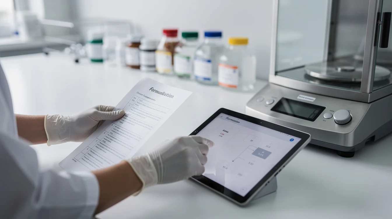
A pharmaceutical printer is not simply a screen with a machine attached. It occupies a working environment: benches, storage, cleaning routines, protective equipment and handover points. Studio Aslak Siimes’ involvement makes this broader product-design territory particularly relevant. The enclosure, access points and interface should support the same sequence of work rather than asking pharmacists to reconcile competing logics.
PillPack offers a useful parallel outside compounding. Its dose-organised packaging demonstrates how arranging information around a person’s routine can make a complex medication regimen more understandable. It is not evidence that a pharmaceutical printer is safe. It does show that the organisation of a service can matter as much as the object that delivers it.
For a system such as Aurum, that principle suggests a workflow organised around meaningful preparation states: materials checked, formulation reviewed, production completed, required checks documented and preparation released. These are proposed interface distinctions, not verified Aurum features. A pharmacist should be able to see which state has been reached without treating machine completion as authorisation to dispense.
Physical design can reinforce those distinctions. A pharmacy might provide separate, clearly identified locations for unreviewed output and released preparations, subject to its procedures. Screen and bench would then tell the same story. A thoughtful handover view could likewise show a colleague what remains unresolved without requiring a verbal reconstruction of the entire job.
This is the strongest case for the product category: automation can make professional work more visible, consistent and transferable. Simplicity becomes valuable when it removes scavenger hunts for information—not when it removes the information itself.
CONTRA: A Calm Interface Can Manufacture Confidence
The danger is that the very qualities celebrated in consumer product design—minimalism, seamlessness, reassuring feedback—can become liabilities in a pharmacy. A large green tick may mean that a production cycle ended successfully. A hurried operator could read it as confirmation that the treatment is correct. Those are radically different claims. Even outside healthcare, a lamp that acts like a friend raises a related question: what does a product’s reassuring behaviour actually warrant us trusting?
Automation bias is not a character flaw unique to careless users. It is a foreseeable risk when people work with apparently competent systems under pressure. If a software-generated recommendation is easier to accept than inspect, the interface has already tilted the decision. A confirmation button does not restore meaningful oversight when the evidence behind it remains hidden.
Suppose a prescription is expressed in milligrams while a preparation parameter uses a concentration per millilitre. A polished screen showing only the final quantity conceals the relationship the pharmacist needs to check. A better design would expose the relevant inputs, units, calculation and formulation reference at the decision point. Any permitted rounding should be visible rather than silently absorbed into a neat result.
Lisanne Bainbridge’s 1983 paper “Ironies of Automation” identified the enduring problem: automation can leave people responsible for exceptional situations while reducing their involvement in routine operation. Applied here, the question is uncomfortable. If pharmacists mainly approve pre-filled screens, what supports their ability to detect the unusual case?
A trustworthy interface must make disagreement operationally possible. It needs an obvious route to pause, investigate and reject—not merely an elegant route to continue.
CONTRA: Responsibility Cannot Be a Final Checkbox
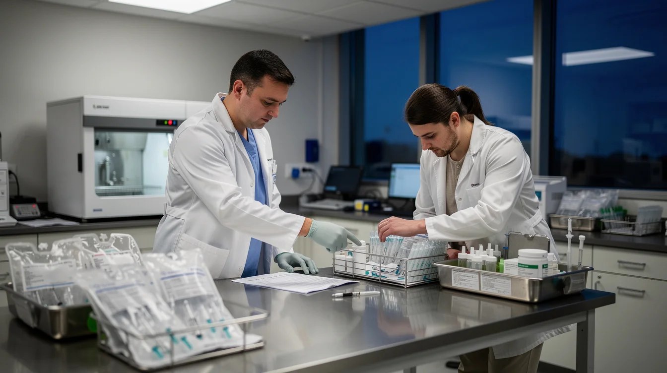
“Empowerment” becomes hollow if the pharmacist inherits liability without corresponding access to evidence. A system that proposes settings should make their provenance accessible: which formulation version was used, which inputs were entered, which parameters changed and which checks remain outstanding. Otherwise, professional judgement risks becoming a ceremonial signature at the end of an opaque process.
Ben Shneiderman’s work on human-centred automation offers a useful counterpoint to the assumption that greater automation requires less human control. The ambition should be both capable automation and meaningful control. In compounding, that means a pharmacist can interrogate a preparation without losing their place, and an interrupted job can be recovered through a defined procedure rather than an improvised workaround.
Not every action deserves an alert. Warning fatigue can make indiscriminate interruption dangerous in its own way. A changed patient-specific dose, an expired ingredient and an administrative correction should not receive identical visual treatment. The interface needs a defensible hierarchy of consequences, with any overrides governed by the pharmacy’s validated procedures.
Evaluation must also move beyond a demonstration in which every input is correct. Representative pharmacists should encounter changed prescriptions, unavailable materials, interrupted production and handovers between staff. Designers should examine whether users spot consequential differences, understand machine status and know when to stop. Speed alone is an inadequate success metric. As with design that encourages scrutiny of fake news, the aim is to strengthen judgement rather than reward passive acceptance.
Aurum’s promise should therefore be judged against a demanding standard: does the system reduce repetitive labour while improving the pharmacist’s ability to challenge its output? The most responsible print button may be the one that sometimes refuses to be the next step. That is not failed convenience. It is product design taking its context seriously.
FAQ
What is CurifyLabs’ PharmaPrinter Aurum?
It is a pharmaceutical compounding system designed by Studio Aslak Siimes to improve the creation of patient-specific medicine. The supplied source summary does not establish its detailed interface functions, supported formulations or clinical performance.
Can automated compounding replace a pharmacist’s judgement?
No. Automating preparation tasks does not establish that a treatment is appropriate for an individual patient. Professional review, applicable quality checks and release procedures remain essential; their precise requirements depend on the preparation and jurisdiction.
Which interface features would support safer decisions?
Clearly connected doses and units, visible formulation versions, prominent changes, accessible calculation details and distinct production and release states would support scrutiny. These are design recommendations, not confirmed features of Aurum, and they require validation in practice.
How should a pharmacy assess a compounding interface?
Test realistic routine and exceptional scenarios with representative users. Assess comprehension, error detection, traceability, recovery and handover alongside efficiency. A fast workflow is insufficient if pharmacists cannot explain, question or safely interrupt what the system is doing.
If personalised medicine becomes easier to produce, should good design make approval faster—or make the reasons to withhold it harder to overlook?
Watch the Mainifesto Short
Get the Mainifesto weekly — curated design debates, speculative ideas and the week's best articles every Saturday.
Editorial Perspectives
Questions and counterpoints developed by the Mainifesto editorial desk to extend the discussion.
Perspective 1
I’m for automating the repetitive work: craftsmanship lives in knowing what to accept, not in repeating every movement by hand. With Aurum, I’d want the recipe, dose and any deviations laid out as clearly as a material sample under good light, so the pharmacist has more room to judge—not less.
Perspective 2
I’m against treating faster approval as the design goal; a system can produce something precisely without establishing that it should be produced. Parametric design has the same trap: who sets the constraints, and does the interface make a pharmacist’s reason to stop as visible as the button to proceed?