
The Guggenheim’s White Walls Were Never a Neutral Choice
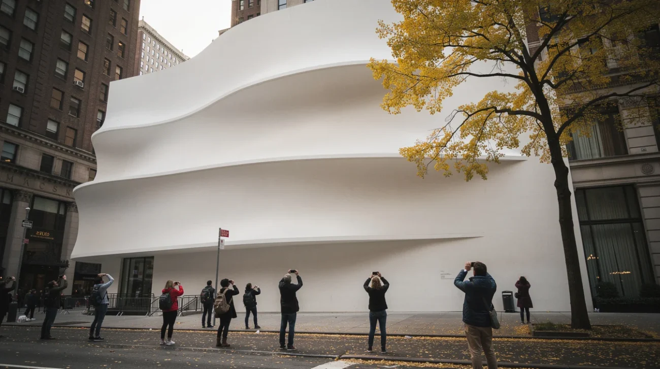
The Guggenheim’s white walls look inevitable. Against Manhattan’s masonry and Central Park’s shifting greens, the museum’s pale spiral reads as architecture distilled into a logo. But inevitability is often a maintenance decision repeated until nobody remembers it was a choice.
In an Architectural Digest excerpt from her forthcoming book, A Dead White: An Argument Against White Paint, Wendy S. Walters revisits Frank Lloyd Wright’s opposition to white paint, including the shade he called “a devastating color”. That resistance unsettles the museum’s familiar image. The building opened in 1959, after Wright’s death; its subsequent life could not be supervised by its author.
The dispute is bigger than a paint chart. When architectural intention and public recognition diverge, conservation must choose what kind of authenticity it values. There are two serious positions—and neither gets to pretend its preferred colour is neutral.
PRO: Protect the Architecture, Not Its Branding
The case for prioritising Wright begins with a blunt proposition: familiarity does not make a finish architecturally correct. A building’s colour shapes its mass, apparent temperature and relationship to its surroundings. It is not packaging applied after the real design work has finished.
Wright’s broader practice makes that argument tangible. At Fallingwater, warm-toned concrete terraces work with local sandstone and the woodland setting rather than declaring independence from them. At Taliesin West, desert masonry places the colours and roughness of the Arizona landscape inside the architectural language. Neither project reduces “organic architecture” to a picturesque silhouette. Material and colour perform the integration.
Read through that work, Wright’s hostility to dead white is more than an eccentric preference. An insistently white surface can make a building appear abstract and detached, converting a complicated environmental relationship into an autonomous object. At the Guggenheim, that abstraction is particularly seductive: the spiral becomes a perfect, reproducible sign.
But a sign is not the whole building. If documentary and physical evidence establish a different intended finish, dismissing it because the public expects white would make conservation subservient to recognition. The museum would be preserving the success of its image rather than asking whether that image accurately communicates its architecture.
PRO: Colour Is Evidence, Not Decoration

The larger history of modern architecture gives this position force. Modernism’s popular afterlife has been aggressively bleached. Black-and-white photographs, simplified teaching narratives and immaculate restorations can encourage the false impression that architectural seriousness naturally arrives without colour.
Yet Le Corbusier developed architectural colour systems and used polychromy to alter how rooms and volumes were perceived. The Bauhaus building in Dessau employed interior colour to articulate space and orientation. At Alvar and Aino Aalto’s Paimio Sanatorium, the colour scheme developed with artist Eino Kauria included green patient-room ceilings: colour was part of an environment conceived around vulnerable bodies, not a dispensable flourish.
These examples do not establish what shade belongs on the Guggenheim. They establish why the question deserves technical investigation rather than an appeal to taste. Paint cross-sections, specifications, correspondence and dated photographs should be read together. A photograph cannot reliably establish a paint formula; a forceful quotation cannot establish which proposal was approved or built.
The strongest PRO position therefore protects evidenced architectural intention, not an imagined Wrightian masterpiece. It distinguishes between a colour the architect considered, one he specified and one actually applied. Where those sources converge, conservation should be willing to challenge the postcard. Otherwise, every highly photographed mistake acquires a powerful defence: enough people have seen it.
CONTRA: A Building Does Not Belong to Its Author Forever
The case against restoring an architect’s preferred appearance begins where architectural biography stops: buildings continue to accumulate meaning. Wright’s intentions matter enormously. They do not automatically cancel everything that happened after his death.
For generations, the Guggenheim’s pale exterior has framed first museum visits, school trips, demonstrations, holiday photographs and ordinary walks along Fifth Avenue. Those encounters are not intellectually inferior to an architect’s correspondence. They are part of how a private design becomes a public landmark. Recognition is not always branding; sometimes it is belonging—a distinction that also informs debates over who gets to shape the public street.
Conservation already accepts that buildings can hold several legitimate histories. David Chipperfield Architects’ restoration of Berlin’s Neues Museum, developed with conservation architect Julian Harrap and completed in 2009, retained evidence of damage and loss rather than returning every room to a seamless nineteenth-century appearance. Its authority lies partly in refusing the fiction that one original moment contains the building’s entire truth.
The Guggenheim presents a different material and historical problem, but the principle travels. A later appearance can acquire significance without being the architect’s ideal. To repaint solely to recover authorial preference could erase an important chapter while presenting the intervention as an act of fidelity. The architect would win the argument by being granted permanent ownership of a building everyone else has spent decades inhabiting and interpreting.
CONTRA: Restoration Can Manufacture the Past
There is also a practical objection: recovering intention is rarely as straightforward as choosing the right historical swatch. Wright’s rejection of white does not, by itself, supply an executable conservation specification. Which surface, which date and which alternative are at issue? Interior walls, exterior coatings and renderings should not be treated as interchangeable evidence.
A colour proposed but never realised occupies a different category from a surviving original paint layer. Applying the former today could create an architectural counterfactual rather than restore a historical condition. That might be defensible, but it should be named honestly.
The Barcelona Pavilion demonstrates how complicated such claims become. Reconstructed in 1986 after the dismantling of Mies van der Rohe and Lilly Reich’s 1929 pavilion, it offers an extraordinary encounter with a lost design. It is nevertheless a reconstruction, not an untouched survivor. Fidelity to a design and continuity of historic fabric are different achievements.
Even a well-supported Guggenheim colour change would require contemporary coatings, maintenance planning and assessment under actual daylight. A tiny sample cannot predict how a curved facade will read across a street. Full-scale trials and public explanation would be essential.
The strongest CONTRA position is therefore not “never change anything”. It asks conservation to weigh intention against material evidence, subsequent history and collective attachment. The tension between inherited significance and present-day needs also shapes debates over adapting heritage to deliver clean water. Keep the familiar appearance if that case prevails—but stop calling it the absence of a decision. White is a historical claim, too.
FAQ: Who Gets to Choose the Guggenheim’s Colour?
Why did Frank Lloyd Wright object to white paint?
Wendy S. Walters’s account foregrounds Wright’s hostility to a shade he called “a devastating color”. His broader work treated colour and materials as active architectural elements. That context helps explain the disagreement, but his opposition alone does not establish a single replacement colour for the Guggenheim.
Does Wright’s opposition mean the Guggenheim should be repainted?
No—not without further argument. A responsible proposal would need to distinguish an unrealised preference from an approved specification and a historically applied finish. It would also need to assess the significance of the museum’s later appearance rather than treating public familiarity as irrelevant.
How do conservators investigate a building’s original colour?
They can examine microscopic paint cross-sections alongside specifications, correspondence, maintenance records and historical images. Each source has limits: coatings weather, photographs distort colour and written proposals may never have been executed. The strongest conclusions come from evidence that supports the same interpretation across several sources.
Can a later appearance be worth preserving?
Yes. Conservation can recognise the significance a building acquires through use, alteration and public memory. But age and familiarity are not automatic guarantees of value. Preserving a later finish requires a reasoned account of what it contributes—and what earlier architectural qualities it may obscure.
When an architect’s intentions and a city’s memories demand different colours, whose version of the building should conservation protect?
Get the Mainifesto weekly — curated design debates, speculative ideas and the week's best articles every Saturday.
Editorial Perspectives
Questions and counterpoints developed by the Mainifesto editorial desk to extend the discussion.
Perspective 1
The supposedly neutral white museum is precisely the sort of myth Barthes taught us to distrust. Conservation should recover Wright’s intended palette where the evidence supports it; familiarity alone is a rather thin architectural argument.
Perspective 2
I would keep the familiar white: a building’s history does not end when its architect stops speaking. Restoration in Mexico City teaches you to distrust the search for a single authentic moment—it can erase everything people have made of a place since.
Perspective 3
Before choosing sides, I’d want reversible paint trials showing how the documented colours affect the spiral’s shadows under changing daylight. Are we conserving a colour specification, or the spatial experience Wright hoped that colour would produce?
Perspective 4
Whose city memory—New Yorkers’, tourists’, or the institution’s marketing department’s? Working between Beirut and Dubai makes me wary of any claim to a shared image: whoever funds the restoration should not automatically get to define what everyone else remembers.