What Happens When Olympic Identity Keeps Changing?
The Olympic brand used to be a monument. Now it is a moving target.
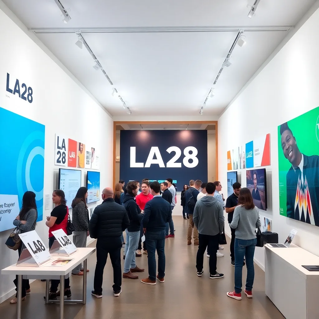
The old fantasy of Olympic identity was stability: a single emblem, a fixed palette, a canonical poster, and a disciplined system that could be repeated for years without losing authority. That model made sense when the Games lived mostly on television, in venue signage, and in a handful of officially sanctioned printed artifacts. LA28 is operating in a different world altogether. Today, an Olympic identity is expected to behave like a social platform, a city-scale wayfinding system, a broadcast package, a merch drop, and a civic campaign at the same time. It has to survive the square format, the vertical story, the giant billboard, the temporary fence wrap, the athlete post, the sponsor co-brand, and the algorithmic remix.
That is the pressure behind LA28’s evolving visual system, as described by the design team in their conversation with Creative Review. The identity is not a frozen logo with a decorative skin. It is a framework designed to mutate without collapsing into chaos. And that is precisely why it matters. Because the Olympic brand is no longer just a symbol of international sport; it is a test case for whether a global institution can remain recognizably itself while being endlessly re-authored by platforms, audiences, and the city it occupies.
The central conflict is brutal and contemporary: consistency creates trust, but adaptability creates survival. If you lock the identity down too tightly, it becomes brittle and dead on arrival. If you loosen it too much, the brand dissolves into content sludge. LA28 is trying to solve the impossible middle ground, and that is what makes this identity worth paying attention to.
Why old Olympic branding no longer behaves in the same way
For most of Olympic history, branding could rely on a limited set of conditions. The identity appeared on tickets, posters, signage, broadcasts, medals, uniforms, and a relatively small number of official surfaces. Its job was to be consistent, memorable, and ceremonial. It was meant to operate like statecraft: repeat the mark, protect the mark, and let the repetition generate authority.
That approach was supported by the media environment. When audiences encountered Olympic identity, they mostly did so through a narrow funnel controlled by broadcasters and host organizers. The system was slower, more centralized, and more legible. Today, the Games are disseminated across feeds where content is cropped, compressed, reposted, memeified, translated, and resized in seconds. One identity must now function as a live image ecosystem rather than a static brand asset library.
Designers such as Wolff Olins, Otl Aicher, and Paula Scher each shaped different eras of this challenge. Aicher’s Munich 1972 system remains a canonical example of clarity through structure; Scher’s wayfinding and identity work taught institutions how a graphic language could inhabit public space with confidence. But the LA28 problem is different again. The city is not merely hosting an event. It is being turned into a distributed stage across multiple channels, and each channel expects the identity to perform differently. The brand must be legible as a whole and elastic in fragments.
That tension is part of a broader shift explored in The Design Industry’s Great Recalibration, where long-held assumptions about authorship, systems, and client expectations are being rewritten across the field. LA28 is just one especially visible example of that larger change.
LA28’s strategy: build a system that can host variation without losing its spine
What makes LA28 interesting is not that it has abandoned coherence, but that it understands coherence as a system of controlled instability. The visual identity is built around the idea that the Games will appear in many forms, to many audiences, over many years, and that these forms will not be identical. Instead of pretending that one image can do all the work, the design system anticipates mutation as a feature.
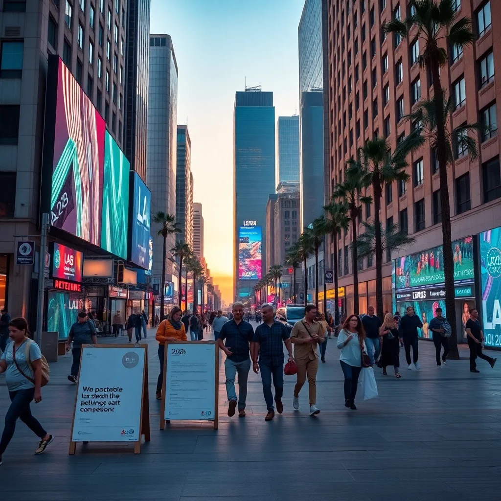
This matters in Los Angeles, a city whose identity has always been plural and unstable. LA is not a single visual language; it is an argument among landscapes, industries, communities, and media forms. The LA28 system absorbs that condition. Rather than insisting on a monolithic “official” expression, it opens space for variation across city districts, digital templates, campaigns, and physical applications. The brand does not simply sit on top of the city; it has to behave like the city’s own contradictory image culture.
That is a radical shift. In the past, Olympic identity often acted as a temporary occupation of place. LA28 instead suggests a more porous condition: the Games are not only installed in Los Angeles, they are remade by Los Angeles. This is where the tension becomes productive. A rigid brand would flatten the city; a flexible brand can absorb its energy, but only if there is a strong enough underlying grammar to stop the whole thing from becoming arbitrary.
That same logic appears in projects that treat place as an active medium rather than a backdrop, such as Venice Biennale Pavilions as Political Stages, where spatial design becomes inseparable from message, audience, and civic meaning.
Consistency is not the enemy. In fact, it is the only thing preventing the brand from becoming noise.
There is a fashionable assumption that adaptability is always good and consistency is always conservative. That is too simple. In practice, adaptability without rules produces visual exhaustion. Everyone has seen the aftermath: campaigns where every post looks like it belongs to a different project, where the identity becomes a loose vibe rather than a recognizable public instrument. For an event like the Olympics, that is fatal.
What the LA28 approach implies is that consistency should no longer be understood as sameness. It should be understood as recognizability across changing conditions. A system may use multiple compositions, typographic behaviors, graphic treatments, or motion rules, yet still feel unmistakably itself if the underlying logic is disciplined. This is how strong design systems work in the digital era: they are less like logos and more like languages.
Think of the most resilient contemporary identities: the BBC’s web and motion rules, Pentagram’s work for institutions that need to function across print and digital, or the adaptive branding systems seen in culture and tech where one mark can become dozens of expressions without losing its voice. The lesson is clear. In a platform environment, visual identity is not a single artifact; it is a set of constraints that produce coherence through variation.
The city is now part of the identity, not just the backdrop to it
LA28 is also a reminder that Olympic branding cannot be separated from urban experience. The visual system will live on temporary infrastructure, public transport, fan zones, venue graphics, merchandise, mobile interfaces, and the city’s own streetscapes. That means the identity has to work in conditions that are messy, political, and uneven. The city itself is not a neutral canvas. It is an active participant.
This raises a more difficult question: should a major event identity aim to dominate urban space, or should it learn how to collaborate with it? The most compelling answer is collaboration, but with teeth. A civic-scale brand should not disappear into the background, because the public needs orientation and confidence. Yet it should not behave like a corporate occupation either. The LA28 system’s value lies in its ability to provide structure while leaving room for local specificity, temporary interventions, and site-sensitive applications.
That is where speculative design becomes real politics. A visual identity can either impose a fantasy of total control or acknowledge that modern cities are plural and contested. The latter is more honest, and more useful. In that sense, LA28 is not only designing graphics; it is designing a set of permissions about how the Games may inhabit the city.
Seen through that lens, the project overlaps with questions raised by Can Culture Become a Public Health Strategy?, where public-facing creative systems are asked to do more than communicate—they are expected to shape behavior, access, and civic atmosphere.
The risk: flexibility can become a license for inconsistency, especially when sponsors and platforms enter the room
Every adaptive system eventually faces the same stress test: too many users. In the Olympic context, those users include broadcasters, social teams, sponsors, partners, venue operators, volunteers, licensees, and the public itself. Each of them will interpret the identity through their own objectives, and each will want the system to do a little more, a little faster, a little louder.
This is where design systems often fail. The initial concept is elegant, but the real world turns it into a negotiation between governance and opportunism. Olympic branding, in particular, is vulnerable because it must accommodate so many stakeholders with divergent needs. A system built for adaptability must therefore also be built for refusal. It needs rules that are strong enough to say no when the wrong use threatens the integrity of the whole.
That is why the LA28 challenge should be read not as a celebration of endless flexibility, but as a demand for disciplined flexibility. The identity must be able to stretch across feeds and streets, but not stretch so far that it becomes unrecognizable or over-commercialized. The best adaptive systems do not invite every mutation. They establish a grammar and punish bad writing.
What LA28 reveals about the future of major-event design
LA28 is not merely updating an Olympic look. It is exposing a structural truth about all large cultural events in the digital age: identity is now a living interface. It is experienced differently by a fan seeing a clip on their phone, a resident navigating city streets, a partner activating a campaign, and a spectator in a venue surrounded by movement, sound, and screens. One design can no longer serve one audience in one place. It must host multiple readings simultaneously.
That is a terrifying demand, but also an opening. It means the designer’s role is expanding from image-maker to system architect. The question is no longer “What does the logo look like?” The more useful question is: “What behaviors does the identity enable, and what behaviors does it forbid?” That is a much harder brief, and a much more interesting one.
At its best, LA28’s evolving system suggests that Olympic identity can stop pretending to be timeless and start being intelligent. Not constant, but coherent. Not fixed, but governed. Not a monument, but a protocol. That shift may be the only way for a global sporting brand to remain visible in a media culture that will keep changing the terms of visibility itself.
In other words: the future Olympic identity will not be the one that never changes. It will be the one that knows exactly when, how, and why to change.
FAQ
Why does Olympic branding need more flexibility now?
Because the Games no longer exist only in venues and broadcasts. They now move through social media, mobile interfaces, urban signage, merchandise, and countless platform-specific formats that all demand different visual behavior.
Does a flexible identity weaken brand recognition?
Not if the system is well designed. Strong adaptive identities keep a consistent grammar, so the brand remains recognizable even when compositions, crops, or motion treatments change.
Why is Los Angeles especially relevant to this conversation?
Los Angeles is a fragmented, image-driven city where culture is already distributed across districts, screens, and industries. That makes it an ideal but demanding setting for an identity that has to feel both civic and mutable.
What is the biggest risk for LA28’s visual system?
That flexibility turns into inconsistency once sponsors, partners, and platforms begin applying the identity in different ways. The system must be open, but not so open that it loses authority.
So what happens when an Olympic identity has to keep changing?
It stops being a logo problem and becomes a governance problem. It stops being about decoration and becomes about rules, permissions, and discipline. And if LA28 gets it right, it may prove that the future of Olympic branding is not in permanence at all, but in controlled, intelligent transformation.
Get the Mainifesto weekly — curated design debates, speculative ideas and the week's best articles every Saturday.


Priya Nair May 28, 2026
If an Olympic identity has to keep mutating, then the real test is whether that change is materially and visually disciplined, not just endlessly novel. A brand that can survive across screens, streets, and merchandise without waste or confusion feels more like a living system than a fixed logo—but stability can still come from clear rules, not constant reinvention.
Nora Vidal May 28, 2026
The Olympics have always sold themselves as timeless, but this sort of visual shape-shifting gives the game away: permanence is now an expensive costume. What we’re left with is less a monument than a serial novel, edited for algorithms and sponsor comfort, and that hardly reads like stability.
Daniel Okonkwo May 28, 2026
Yes, it’s a design system now, and that’s not automatically a downgrade. In digital culture, identities have to breathe across motion, apps, feeds, and live city surfaces—but the risk is that flexibility gets mistaken for meaning, when really it’s just better packaging for the same machinery.
Elena March May 29, 2026
I’d say the identity becomes stable through governance, not fixed form. If every version still anchors to the city and the public realm, then change is manageable; if not, it becomes visual churn with a very expensive footprint.
Karim Haddad May 29, 2026
It’s a system, full stop. The Olympic logo used to behave like a monument; now it behaves like infrastructure, adapting to different channels, stakeholders, and political pressures whether designers admit it or not.