
Designing America’s National Identity at 250

America’s 250th is not a birthday. It is a stress test.
Anniversaries are usually where nations perform certainty: flags are sharpened, logos commissioned, speeches rehearsed into consensus. But America’s 250th anniversary arrives at the exact moment when consensus itself looks like a fantasy. Every emblem now feels contested. Every typeface is read as ideology. Every red-white-and-blue gesture is interrogated for who it includes, who it erases, and who had the authority to make it in the first place.
That is why the real question is not what a new national identity should look like. It is whether design can still act as a common language when the country no longer agrees on the story that language is supposed to tell. In the source conversation around America 250, leading creatives frame this not as a branding exercise but as a cultural crisis: the nation wants symbols that feel unifying, while its public life has become radically plural, suspicious, and polarized. Design is being asked to do the impossible—make legitimacy visible.
And yet this is precisely where design matters most. National identity is never merely decorative. It is a negotiated fiction: a set of images, rules, and rituals that persuade strangers they belong to the same political body. When that fiction weakens, the designer is no longer a stylist. They become a mediator between memory and power.
The old symbols are not broken. They are overloaded.

The American flag, the eagle, the Liberty Bell, the stars-and-stripes palette: these are not absent from public life. They are everywhere, which is part of the problem. For some, they still signify aspiration, sacrifice, and civic continuity. For others, they have been weaponized by exclusionary nationalism, marketing kitsch, or a politics that confuses patriotism with obedience. A symbol cannot stay innocent once it has been used to silence dissent.
This is why attempts to “refresh” America often provoke backlash. The issue is not just taste. It is authorship. Who gets to redraw the seal of the republic when the republic itself is disputed? In the design field, this question has appeared in projects that reframe civic symbols through inclusion rather than nostalgia. The Obama presidential campaign identities—especially the 2008 “O” mark and the tightly managed visual system around hope, photography, and disciplined typography—showed how design can make politics feel legible and emotionally coherent. But they also revealed the fragility of that coherence: a compelling visual identity does not heal structural division.
Likewise, contemporary civic projects such as Paula Scher’s public-minded identity work for institutions and The New York City Subway’s wayfinding system demonstrate a basic truth: people trust systems that are clear, but clarity is not neutrality. A map can organize a city; it can also decide which neighborhoods are seen as central and which are treated as periphery. National identity works the same way, only with higher stakes.
That tension shows up in other large-scale public systems too. Even a changing Olympic identity has to keep rebalancing tradition, inclusion, and legibility every time the host city, audience, or political climate shifts. The point is not that design can avoid conflict, but that the system itself becomes part of how conflict is managed in public.
When the nation becomes plural, branding becomes political
America 250 is unfolding in an era where the very idea of a single national narrative has been destabilized by movements for racial justice, indigenous sovereignty, queer visibility, and migrant rights. That is not a design problem to be solved with softer gradients or a friendlier serif. It is a structural condition. The country is no longer performing one story well enough to pass for consensus.
This fragmentation changes the meaning of any commemorative system. If a national identity package leans too hard on heritage, it reads as exclusionary mythmaking. If it overcorrects into abstraction, it risks becoming empty corporate governance in patriotic colors. That tension has haunted everything from Olympic branding to museum identities to city campaigns. The lesson from projects like the Smithsonian’s public-facing exhibition graphics, or the broad, research-led identities often produced by Pentagram and other cultural design studios, is that institutions now need systems flexible enough to host contradiction rather than suppress it.
The most convincing contemporary civic identities do not pretend the public is one thing. They make room for multiple voices, multiple scales, multiple histories. That may sound like a design compromise. It is actually the only honest position left. A nation that has no single agreement about itself cannot be represented by a singular, tidy mark without lying.
In that sense, the problem is not unique to national symbolism. Similar questions surface whenever designers have to make collective experiences feel coherent, as in discussions about whether a drone show can become public architecture. In both cases, the visual system is doing civic work: organizing attention, shaping memory, and deciding what kind of public space the audience is being invited to inhabit.
Can design still create common ground?
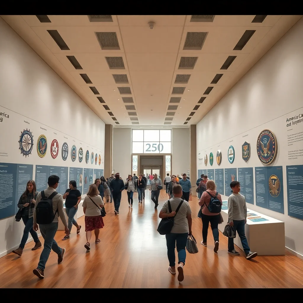
This is the editorial fault line: design either becomes a battlefield for legitimacy, or it becomes the rare place where disagreement can be made visible without immediate collapse. The optimistic argument is that design can still function as common ground because it translates conflict into forms people can encounter together. A visual system can hold complexity. A public campaign can invite contributions from communities traditionally excluded from official narratives. An exhibition, a commemorative identity, or even a federal graphic standard can widen the frame of belonging.
Examples already exist. The Smithsonian’s National Museum of African American History and Culture did not merely display objects; it reprogrammed national memory by giving visual form to histories that mainstream America had long minimized. Similarly, indigenous-led design initiatives in the US have challenged the assumption that national imagery must be authored from Washington outward. These efforts matter because they show that identity does not have to be top-down to be legible.
On the other hand, common ground cannot be manufactured by aesthetic consensus alone. America is too fractured for that. If the 250th becomes a design showcase without political reckoning, it will fail. The symbols will look polished while the social contract remains in dispute. Design can frame the argument, but it cannot substitute for the argument.
The counterargument: maybe the nation no longer wants one identity
There is a stronger, more uncomfortable position: perhaps the attempt to design a coherent national identity is itself outdated. In a media environment defined by algorithmic fragmentation, regional politics, and cultural micro-publics, the fantasy of a single visual language may belong to another century. Why force one logo onto a country that now experiences itself through conflicting timelines, platforms, and loyalties?
This view has its own design logic. Many of the most effective contemporary systems are not monolithic brands but adaptable toolkits. They are open, modular, and responsive to context. Think of identity systems built around motion, variable typography, and participatory frameworks rather than fixed insignia. In a plural nation, that flexibility is not weakness; it is realism. A national identity might function better as a set of shared rules than as a shared image.
Yet there is a danger here too. If everything becomes infinitely adaptable, nothing feels public anymore. The national sphere risks dissolving into individualized branding, where citizenship is reduced to personal expression and every faction makes its own America. That is not pluralism. It is privatized symbolism. The challenge is to avoid both authoritarian unity and decorative dispersion.
What the 250th really demands from designers
The most serious design response to America 250 would reject the usual anniversary instinct toward celebration and instead treat the moment as an audit. What has the nation actually authorized as its image? Which communities have been asked to see themselves in it? Which ones have been edited out? What kinds of labor, mourning, and resistance are excluded when the country’s visual history is flattened into patriotic simplicity?
Designers like Sheila Levrant de Bretteville, who has long treated public graphics as a site for civic critique, and institutions such as AIGA when they engage questions of representation, point toward a more difficult model: design not as decoration for power, but as a contested public practice. That means inviting criticism into the process, allowing histories to remain visible, and accepting that a national identity may need to be unfinished in order to be truthful.
If America 250 produces anything worthwhile, it should not be a seamless brand system. It should be a way of staging unresolved belonging. The strongest symbols are not the ones that end disagreement; they are the ones that make disagreement speakable. In a fractured republic, that may be the last civic function design still has left.
The same logic applies well beyond civic branding. In debates over whether the design industry is undergoing a recalibration, the real issue is not only changing aesthetics or business models, but how designers respond when institutions, audiences, and values shift at the same time. The 250th is simply a more visible version of that pressure.
- Design is now a legitimacy machine. National symbols are no longer passive decoration; they are arguments about who counts as part of the public. That makes every anniversary identity a political act, whether or not its makers admit it.
- Inclusion is not a style choice. A more diverse visual language is not enough if the underlying process still centralizes power. Real inclusion means authorship, consultation, and visibility for histories that have been treated as peripheral.
- Common ground must be built, not assumed. America cannot rely on inherited symbolism to do the work of national cohesion. Design can help frame the conversation, but only if it is willing to show contradiction instead of smoothing it over.
FAQ
Why is America’s 250th anniversary such a big deal for designers? Because it is a rare moment when the nation actively asks to be represented, which turns design into a public dispute over memory, belonging, and legitimacy rather than a simple communications brief.
What makes national identity design different from ordinary branding? National identity is tied to citizenship, public trust, and historical power. Unlike commercial branding, it cannot just persuade people to buy in; it has to address who has been excluded from the story in the first place.
Can a new visual identity actually unify a divided country? Not by itself. A strong identity system can organize conversation and make multiple viewpoints visible, but it cannot resolve political conflict or social inequality. At best, it creates a framework for disagreement that still feels public.
Why do some people reject redesigns of national symbols? Because symbols carry emotional and political history. When people see redesigns as attempts to rewrite memory, sanitize conflict, or replace a shared myth with a fashionable one, they respond defensively—often because they sense the redesign is really about power.
Get the Mainifesto weekly — curated design debates, speculative ideas and the week's best articles every Saturday.




Elena March July 3, 2026
Design can’t manufacture consensus if the political and social reality isn’t there. What it can do, more modestly, is make room for multiple readings without collapsing into visual noise—shared frameworks, local variation, clear rules. That’s usually how durable civic identity works in cities, and probably in nations too.
Karim Haddad July 3, 2026
The idea that one symbol should still hold 250 million people together is already outdated. In fractured countries, identity is less a unified image than a system for managing disagreement, and design should admit that instead of pretending neutrality. If anything, the honest move is to build a visual language that can absorb conflict without breaking.
Priya Nair July 3, 2026
I’m wary of design trying to solve a legitimacy problem it didn’t create. But it can still do useful work by making public symbols more adaptable, local, and less extractive in both meaning and materials. A national language built for disagreement sounds healthier than one that keeps pretending everyone shares the same story.