Chromatic floor transitions color gradations underfoot to guide circulation
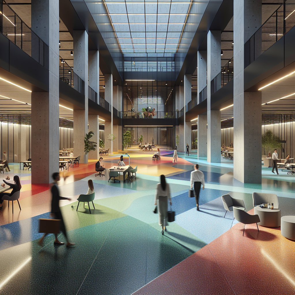
Chromatic Floor Transitions: Color Gradations Underfoot to Guide Circulation
When navigating a building, our eyes instinctively seek visual cues to guide us through spaces. In recent years, designers and architects have begun harnessing the power of chromatic floor transitions to subtly guide circulation, enhancing both functionality and aesthetics. This innovative approach employs color gradations underfoot, creating intuitive pathways that effortlessly lead occupants through complex environments. From commercial offices to healthcare facilities, the strategic use of color in flooring is redefining spatial navigation and user experience.
The Psychology of Color in Spatial Navigation
Color profoundly influences human psychology, affecting emotions, behaviors, and decision-making processes. In architectural design, color theory is meticulously applied to evoke specific responses and facilitate intuitive navigation. Chromatic floor transitions leverage this psychological impact, using subtle shifts in hue, saturation, and brightness to delineate spaces and guide movement.
For instance, warmer tones like reds and oranges are known to energize and stimulate, making them ideal for high-activity zones or communal areas. Conversely, cooler shades such as blues and greens induce calmness and tranquility, suitable for quiet spaces or areas designated for relaxation. By thoughtfully integrating these color transitions, designers can create seamless visual pathways that intuitively guide users through a building.
In healthcare settings, for example, chromatic transitions can significantly enhance wayfinding, reducing stress and confusion among patients and visitors. Gradual shifts from calming blues in waiting areas to warmer tones in consultation rooms subtly indicate transitions between spaces, enhancing the overall patient experience.
Chromatic Transitions in Commercial and Public Spaces
Commercial environments, particularly offices and retail spaces, benefit immensely from chromatic floor transitions. Modern workplaces increasingly adopt open-plan layouts, where clear visual cues are essential for effective navigation. Color gradations on flooring can effortlessly demarcate collaborative zones, individual workstations, and circulation paths without the need for intrusive physical barriers.
Consider Google’s headquarters, where vibrant color transitions on floors help employees navigate the expansive office spaces. The strategic use of color not only aids navigation but also reinforces brand identity and fosters a dynamic work environment. Similarly, retail spaces employ chromatic transitions to subtly guide customers through product displays, enhancing the shopping experience and increasing dwell time.
Moreover, integrating smart home technology with chromatic flooring can further enhance navigation and user interaction. Sensors embedded within flooring materials can trigger subtle lighting changes, amplifying the visual impact of color transitions and creating interactive, responsive environments.
Sustainability and Material Innovation in Chromatic Flooring
As sustainability becomes paramount in contemporary architecture, designers are exploring eco-friendly materials to implement chromatic floor transitions. Recycled materials, biodegradable components, and low-impact production methods are increasingly favored, aligning aesthetic innovation with environmental responsibility.
Innovative materials such as terrazzo, made from recycled aggregates, are experiencing a resurgence in popularity. Terrazzo flooring not only offers exceptional durability but also allows for seamless chromatic transitions, enhancing both sustainability and visual appeal. Additionally, the use of natural pigments and dyes derived from plants or minerals further reinforces the eco-conscious ethos of modern design.
Furthermore, the integration of biophilic design principles with chromatic flooring can significantly enhance occupant well-being. Incorporating natural color palettes inspired by landscapes, forests, or oceans fosters a deeper connection with nature, reducing stress and improving overall mental health.
Case Studies: Chromatic Floor Transitions in Action
Several notable projects exemplify the successful implementation of chromatic floor transitions. The Seattle Central Library, designed by renowned architect Rem Koolhaas, employs vibrant color gradations on floors to intuitively guide visitors through its intricate layout. Each floor features distinct hues, subtly transitioning between spaces and providing clear visual orientation.
Another remarkable example is the Apple Park headquarters in Cupertino, California. Designed by Foster + Partners, the campus integrates seamless chromatic transitions in flooring to delineate workspaces, communal areas, and circulation paths. The thoughtful use of color enhances navigation, fosters collaboration, and reinforces Apple’s innovative brand identity.
In residential architecture, chromatic transitions are equally impactful. The trend towards minimalist chic design has prompted homeowners to adopt subtle color gradations in flooring, creating harmonious transitions between living spaces. This approach enhances spatial flow, visually expands interiors, and imbues homes with understated elegance.
Technological Integration and Future Trends
Advancements in technology continue to shape the evolution of chromatic floor transitions. Digital fabrication techniques, such as 3D printing and CNC milling, enable precise control over color gradations, allowing designers to create intricate patterns and seamless transitions previously unattainable through traditional methods.
Moreover, the emergence of interactive flooring technologies, incorporating sensors and responsive lighting, opens new possibilities for dynamic chromatic transitions. Floors that react to occupant movement, adjusting color and intensity in real-time, promise to revolutionize spatial navigation and user engagement.
Additionally, augmented reality (AR) and virtual reality (VR) technologies are increasingly utilized in the design process, enabling architects and designers to visualize and refine chromatic transitions before physical implementation. This immersive approach ensures optimal user experience and seamless integration of color gradations within architectural spaces.
Challenges and Considerations in Implementing Chromatic Floor Transitions
While chromatic floor transitions offer numerous benefits, designers must carefully consider several factors to ensure successful implementation. Color selection must account for accessibility, ensuring adequate contrast and visibility for individuals with visual impairments. Additionally, maintenance considerations, such as durability and ease of cleaning, are crucial in high-traffic environments.
Furthermore, cultural associations and psychological impacts of color vary across different demographics and regions. Designers must thoughtfully consider these nuances to ensure chromatic transitions resonate positively with diverse user groups.
Finally, achieving seamless chromatic transitions requires meticulous planning and precise execution. Collaboration between architects, interior designers, and flooring specialists is essential to ensure cohesive integration within the overall design scheme.
Conclusion: A Vibrant Future for Chromatic Floor Transitions
Chromatic floor transitions represent a compelling convergence of aesthetics, functionality, and psychology in contemporary architecture and design. By harnessing the power of color gradations underfoot, designers can intuitively guide circulation, enhance spatial navigation, and elevate user experience across diverse environments.
As technological advancements and sustainable practices continue to evolve, the potential for chromatic floor transitions expands exponentially. From interactive flooring systems to eco-friendly materials, the future promises innovative solutions that seamlessly blend visual appeal with practical functionality.
Ultimately, chromatic floor transitions exemplify the transformative potential of thoughtful design, redefining how we navigate and experience the built environment. Whether in commercial spaces, healthcare facilities, or residential interiors, the strategic use of color underfoot offers a vibrant pathway towards intuitive, engaging, and human-centered design.
Get the Mainifesto weekly — curated design debates, speculative ideas and the week's best articles every Saturday.