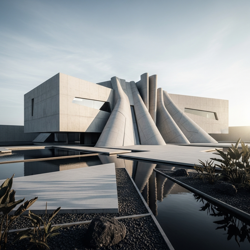
The Art of Chromatic Harmony: Color Theory in Architectural Design

The realm of architectural design is vast and ever-evolving, and amidst this dynamic landscape lies an intrinsic aspect that subtly yet profoundly impacts the human experience: color. In this comprehensive exploration, we delve into the fundamental principles of color theory, their applications in architectural design, and how they wield the power to shape our interactions with built environments.
The Color Wheel and Harmonious Color Schemes
A core tenet of color theory is the color wheel, a circular arrangement of hues illustrating the relationships among primary, secondary, and tertiary colors. This foundation enables architects and designers to create harmonious and visually appealing color schemes. Three primary techniques to achieve this balance are analogous, complementary, and monochromatic palettes.
Analogous Color Schemes
Analogous color schemes utilize adjacent hues on the color wheel, resulting in a cohesive and soothing atmosphere. A shining example of this approach is the Bahá’í House of Worship in India, often referred to as the Lotus Temple. Its white marble exterior and interior blend seamlessly with the lush green surroundings, creating a serene environment for reflection and contemplation.
Complementary Color Schemes
Complementary color schemes, by contrast, involve the use of colors directly opposite each other on the wheel. This bold approach captures attention and invigorates spaces, such as the iconic Hundertwasserhaus in Vienna. The vivid juxtaposition of hues like blue and orange or purple and yellow contributes to its whimsical and enchanting presence.
Monochromatic Color Schemes
Monochromatic palettes, in which varying shades, tones, and tints of a single color are employed, exude elegance and simplicity. The Guggenheim Museum in Bilbao, Spain, exemplifies this approach with its titanium-clad facade that harmonizes with the surrounding environment, subtly reflecting the sky and nearby river.
Color Psychology and its Role in Architectural Design
Beyond these techniques, color psychology plays a crucial role in architectural design, as various hues elicit specific emotional responses. For instance, blue evokes feelings of tranquility and trust, making it ideal for healthcare facilities, while red, associated with energy and passion, enlivens entertainment venues like theaters and restaurants.
Sustainability and Color Theory in Contemporary Architecture
Sustainability is another key consideration in contemporary architecture, and color theory factors into this movement as well. Through the strategic use of color, architects can regulate temperature and energy consumption. Light colors, for example, reflect sunlight and help maintain cooler interiors, while dark hues absorb heat, thereby reducing heating costs in colder climates.
Ultimately, the artful application of color theory in architectural design not only enhances aesthetic appeal but also profoundly impacts our emotional and psychological experiences within these spaces. By skillfully marrying form and function, architects can create built environments that resonate with our innermost selves, simultaneously enriching our lives and elevating the human spirit.


