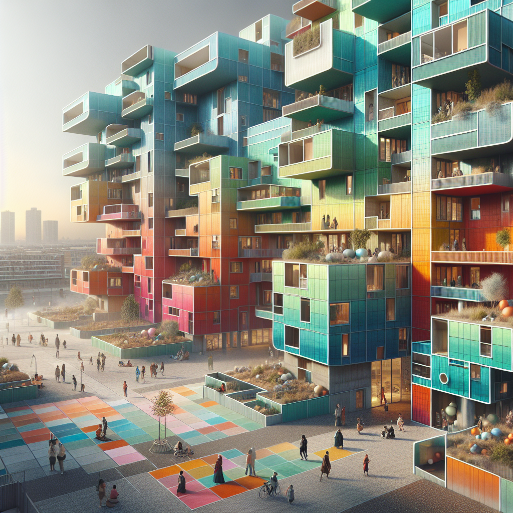
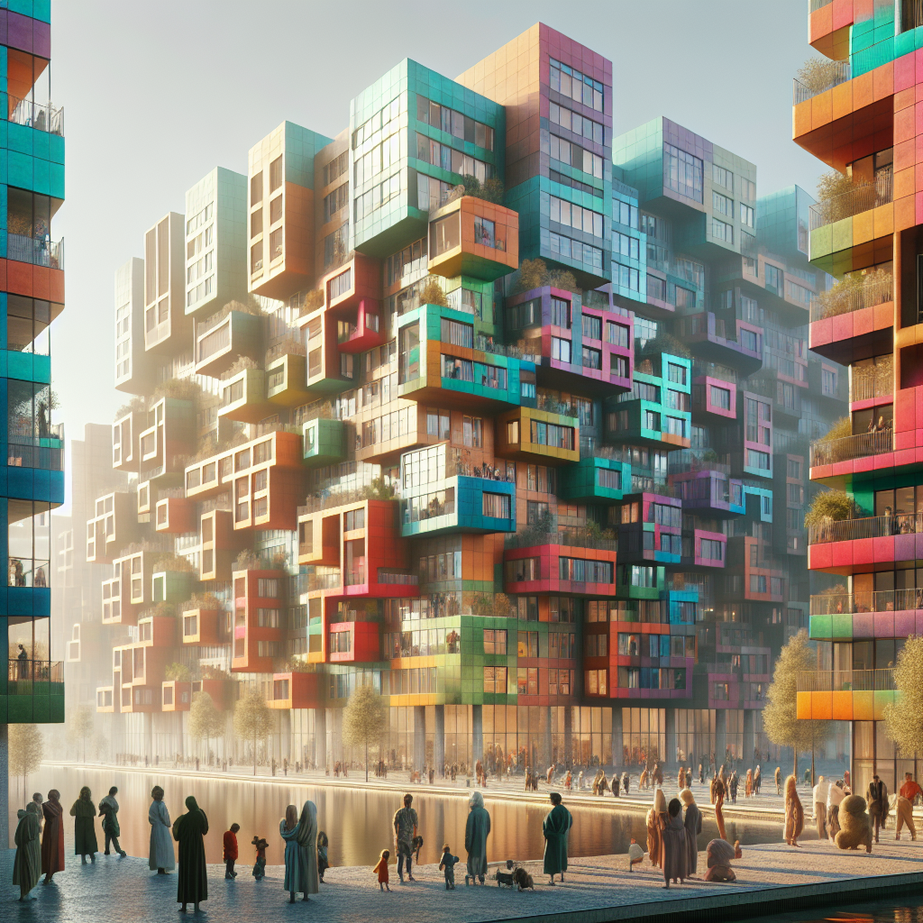
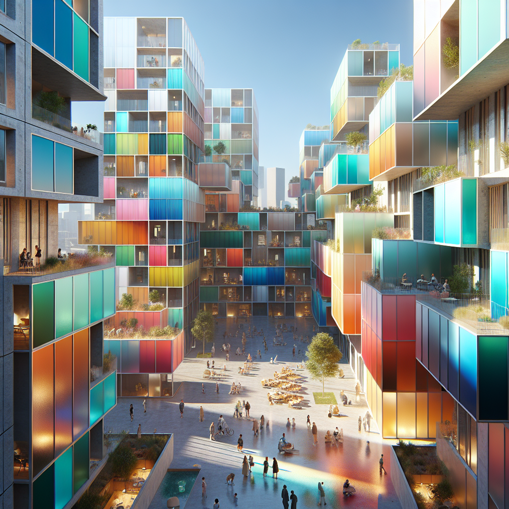
Color-coded communal living: each apartment sporting a distinct hue identity
Color-Coded Communal Living: Designing Identity Through Hue
In an era where architecture increasingly serves as a canvas for individuality and community expression, color-coded communal living has emerged as a radical yet harmonious design movement. Imagine a residential complex where each apartment is defined by its own chromatic identity—an architectural symphony of hues that both distinguishes and unites. This concept transcends mere aesthetics; it reshapes how we perceive belonging, privacy, and emotional resonance within shared environments.
The Psychology of Color in Architecture
Color has long been recognized as a powerful psychological and spatial tool. From the soothing greens of biophilic interiors to the invigorating reds of creative studios, hues influence mood, behavior, and perception. According to research by the Environmental Psychology discipline, color directly affects human well-being and social interaction. In communal housing, this translates into a potent opportunity: to design emotional microclimates within a single architectural organism.
Architects and designers are increasingly leveraging color as a structural language rather than a decorative afterthought. Projects like Le Corbusier’s Unité d’Habitation in Marseille or Ricardo Legorreta’s vividly painted Mexican complexes foreshadowed this chromatic revolution. Yet today’s color-coded living environments go further, integrating hue as a defining element of spatial identity, wayfinding, and community cohesion.
From Facade to Feeling: The Rise of Chromatic Architecture
Across Europe and Asia, color-coded apartment complexes are reimagining urban living. In Copenhagen’s “Superkilen Park,” each neighborhood zone is defined by a dominant hue—red, black, or green—creating a visual rhythm that reflects cultural diversity. Similarly, Tokyo’s “Reversible Destiny Lofts” by Shusaku Arakawa and Madeline Gins employ vibrant, disorienting palettes to challenge conventional living habits and stimulate sensory awareness.
These projects exemplify how color-coded architecture fosters both individuality and unity. Residents identify their homes not merely by number or floor, but by hue—“the blue apartment,” “the ochre loft,” “the jade corner.” This chromatic mapping cultivates a sense of belonging that is both personal and collective, reinforcing the idea that color can be a social infrastructure.
Hue as Identity: Designing Emotional Territories
Color-coded communal living introduces a new typology of design thinking: one where hue becomes a marker of identity and emotion. In multi-residential developments, assigning each apartment a distinct color palette can enhance psychological comfort and self-expression. According to a 2023 report by the World Design Organization, color-driven design strategies are increasingly employed to improve residents’ mental well-being and spatial orientation.
Architectural studios are experimenting with chromatic zoning that aligns with personality archetypes and daily rhythms. For instance, cool-toned apartments—dominated by shades of blue and gray—are often allocated to residents seeking tranquility, while warmer palettes of terracotta, coral, and amber appeal to those drawn to sociability and energy. The result is a living ecosystem that mirrors the diversity of human temperament.
Materiality and Light: Crafting Chromatic Depth
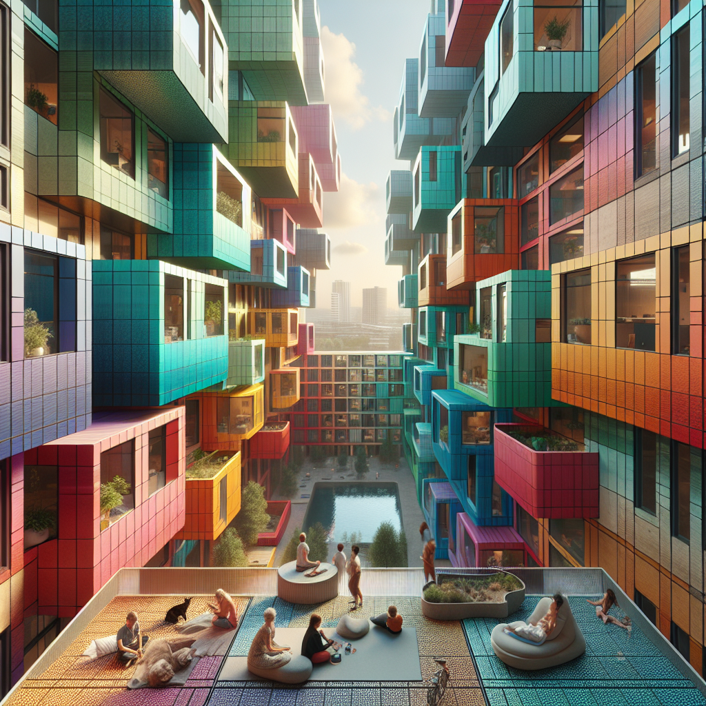
In the most successful color-coded communities, hue is not applied superficially but embedded into the material DNA of the architecture. Pigmented concrete, anodized aluminum panels, and mineral-based paints ensure longevity and tactile richness. The interplay of natural light further transforms these hues throughout the day—sunrise softens a crimson wall into rose, while dusk deepens turquoise into teal. This dynamic relationship between color, material, and light turns each apartment into a living organism that evolves with time.
Designers are also exploring the integration of color theory in architectural design to ensure harmony across shared spaces. Communal corridors might transition through gradient tones, guiding residents intuitively toward their private zones. This approach echoes the principles of biophilic design, where visual stimuli are orchestrated to nurture calm and connection.
Case Study: The Chromatic Commune, Rotterdam
One of the most compelling examples of color-coded communal living is the “Chromatic Commune” in Rotterdam, completed in 2024 by Studio Veldman. The project comprises 48 apartments, each assigned a distinct hue inspired by the Dutch landscape—from tulip pinks to North Sea blues. The building’s façade is a gradient mosaic, yet the interior experience is profoundly personal. Residents were invited to select their preferred color family during the design phase, creating a participatory process that fused customization with community coherence.
Studio Veldman’s approach underscores a shift toward human-centric architecture. As the firm’s lead architect, Marieke Veldman, explained in an interview, “Color is the most democratic form of personalization—it’s accessible, emotional, and instantly communicative.” The Chromatic Commune’s success lies in its ability to balance individuality with collective harmony, a principle increasingly relevant in post-pandemic urban design.
Technology Meets Color: Smart Chromatic Systems
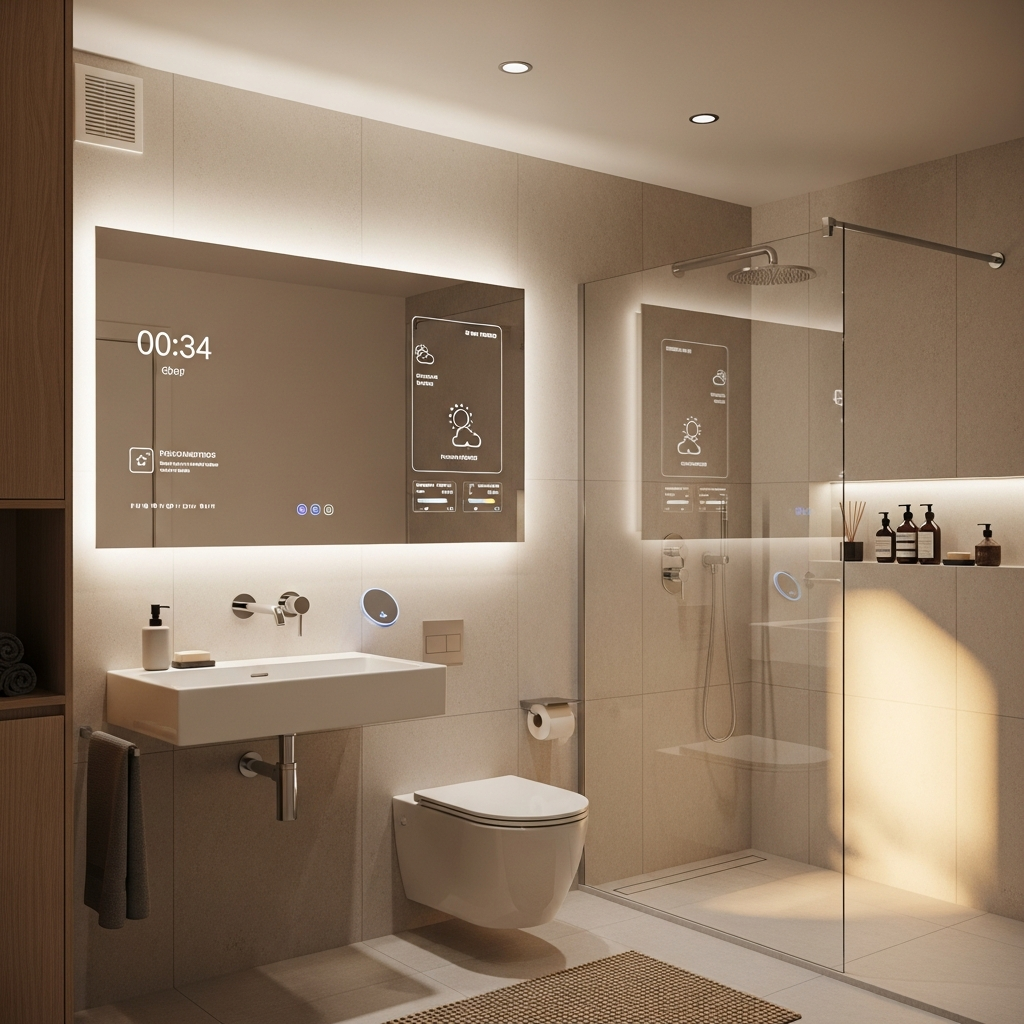
Emerging technologies are amplifying the potential of color-coded living. Smart lighting systems now allow residents to adjust hue intensity based on mood or circadian rhythm, merging emotional well-being with energy efficiency. These innovations echo the adaptive principles seen in responsive design, where architecture reacts dynamically to human needs.
Moreover, digital fabrication techniques enable precise color application across complex geometries, ensuring chromatic consistency from façade to furniture. Some developers are even experimenting with thermochromic materials—surfaces that shift color with temperature—creating buildings that visually respond to environmental change. This intersection of color, technology, and sustainability represents a frontier where design becomes both expressive and ecological.
Social Dynamics and Wayfinding
Beyond aesthetics, color-coded living enhances spatial legibility and social interaction. In large-scale housing complexes, color acts as an intuitive navigation system. Residents and visitors can easily identify zones or apartments through chromatic cues, reducing cognitive load and fostering a sense of orientation. Studies in community-driven architecture suggest that such visual clarity contributes to stronger neighborhood bonds and reduced social anxiety.
Furthermore, shared areas—laundries, lounges, rooftop gardens—often adopt neutral or transitional palettes, creating chromatic “breathing spaces” between vibrant private zones. This deliberate modulation of color intensity ensures balance between stimulation and serenity, echoing the rhythm of communal life itself.
Challenges and Critiques
Despite its appeal, color-coded communal living presents certain challenges. Maintenance of exterior hues under varying weather conditions requires durable materials and periodic upkeep. Cultural associations with specific colors may also vary, demanding sensitivity in multicultural contexts. Architects must navigate these nuances carefully, ensuring that color remains inclusive rather than divisive.
Moreover, there is a fine line between expressive and overwhelming. Over-saturation can lead to visual fatigue, particularly in dense urban environments. The most successful projects employ restraint—balancing bold chromatic gestures with neutral counterpoints, allowing the eye to rest and the mind to breathe.
The Future of Chromatic Communities
As cities continue to densify, the need for emotional and visual differentiation within shared housing will only grow. Color-coded communal living offers a poetic yet practical response—a way to humanize architecture through hue. It redefines the apartment block not as a monotonous grid but as a living spectrum of personalities, each tone contributing to a collective composition.
In this sense, color becomes more than pigment; it becomes a language of empathy, a design strategy that acknowledges individuality within togetherness. The chromatic city of the future may not be uniform or gray but vibrantly plural—a place where every shade tells a story, and every façade reflects the spectrum of human life.
As architects continue to explore this frontier, one truth remains constant: color, when thoughtfully applied, is not decoration—it is identity, emotion, and architecture in its most human form.
Keywords: color-coded architecture, communal living design, chromatic identity, architectural color theory, hue-based housing, emotional design, color psychology in architecture