Immersive color-block staircases: monochromatic steps in gradient transitions
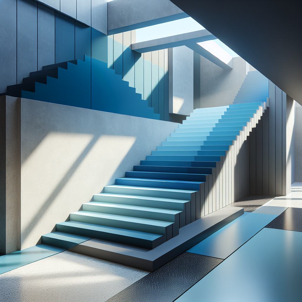
Immersive Color-Block Staircases: Monochromatic Steps in Gradient Transitions
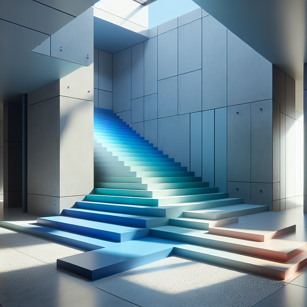
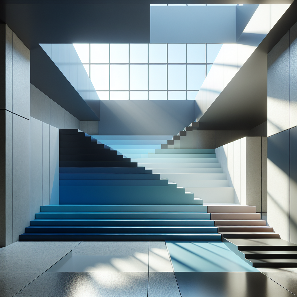
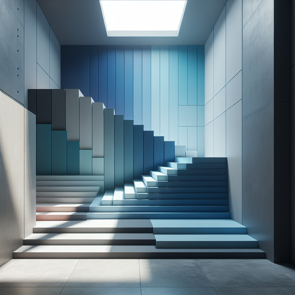
In the evolving lexicon of contemporary interior design, the color-block staircase has emerged as a bold architectural statement—part sculpture, part spatial choreography. No longer a mere functional connector between floors, the staircase has become a stage for chromatic experimentation, where monochromatic gradients unfold like visual symphonies in motion. This trend—aptly described as immersive color-block staircases—fuses psychology, material innovation, and spatial storytelling, transforming circulation into experience.
The Rise of Chromatic Architecture
Color has always been a potent architectural tool, shaping perception and emotion. Yet, in recent years, architects and designers have begun to treat color not as surface ornamentation but as a structural narrative. The staircase, with its rhythmic geometry and vertical progression, offers an ideal canvas for this exploration. By orchestrating gradient transitions—from deep cobalt to pale azure, or from blush rose to pure white—designers are creating environments that engage both body and mind.
This chromatic evolution parallels broader movements in color theory in architectural design, where hue is used to guide movement, evoke mood, and delineate function. In a world increasingly defined by digital gradients and screen-based aesthetics, the physical manifestation of color transitions in built form feels both nostalgic and futuristic.
From Function to Phenomenon
Staircases have long been sites of architectural experimentation—from the spiraling stone marvels of the Vatican Museums to the minimalist glass ascents of contemporary art galleries. Yet the immersive color-block staircase redefines this typology through sensory layering. Each step becomes a tonal note, contributing to a spatial crescendo that unfolds as one ascends or descends.
In residential projects, designers are embracing monochromatic palettes that shift subtly across risers and treads, often using matte lacquers, terrazzo composites, or pigmented concrete. In commercial and cultural spaces, the approach is more theatrical—saturated hues that envelop walls, ceilings, and balustrades, creating a total chromatic environment. The result is a form of experiential minimalism: restrained in geometry, yet emotionally expansive.
Case Studies: Chromatic Narratives in Motion
Consider the staircase at the Valencia Design Institute, where architect Clara Gómez employed a gradient of terracotta tones inspired by the region’s clay architecture. The steps begin in a deep sienna at the base and gradually fade into a soft peach near the skylight, echoing the transition from earth to sky. The project’s tactile surfaces and natural pigments evoke a Mediterranean warmth that is both contemporary and timeless.
In contrast, the Blue Horizon House in Tokyo by Atelier Oki Sato transforms its central staircase into a meditative journey. Each step shifts by a fraction of tone—from indigo to pale mist—culminating in a white landing that opens to a sunlit atrium. The gradient acts as a psychological decompression chamber, aligning with the Japanese concept of ma—the space between things that invites reflection.
These examples reveal how color gradients can articulate architectural rhythm, directing emotional flow as effectively as spatial form. They also demonstrate how designers are reinterpreting modernist purity through chromatic storytelling, echoing the Bauhaus principle that color and structure are inseparable elements of design.
Material Innovation and Technical Precision
Achieving seamless gradient transitions demands both artistry and technical rigor. Advances in digital fabrication and surface finishing have made it possible to produce highly controlled color shifts across materials. Powder-coated steel, resin-infused wood, and micro-pigmented concrete allow for durable, UV-stable hues that maintain chromatic fidelity over time.
Some studios employ parametric modeling to map color intensity across stair geometry, ensuring that each riser aligns with the intended gradient curve. Others use layered glazing or translucent resin to create optical blending effects, where color appears to dissolve under changing light conditions. This approach resonates with the broader trend of immersive visualization in architecture, where digital precision informs tactile experience.
The Psychology of Gradient Spaces
Color psychology plays a central role in the success of these designs. Studies in environmental psychology suggest that gradual color transitions can influence perception of space and time, making vertical movement feel smoother and more intuitive. Warm gradients—reds, oranges, and ochres—tend to energize and uplift, while cool transitions—blues, greens, and lavenders—encourage calm and contemplation.
Designers are increasingly using these principles to choreograph emotional journeys within buildings. In wellness centers, staircases with soft pastel gradients foster relaxation; in retail environments, bold color-block transitions stimulate curiosity and engagement. The result is a subtle form of behavioral design, where chromatic cues guide users without overt signage or instruction.
Immersion and the Instagram Effect
There is also an undeniable visual magnetism to these staircases. Their photogenic quality aligns with the rise of Instagrammable architecture, where spaces are designed to be shared as much as experienced. Yet the best examples transcend mere spectacle. They create moments of introspection within the digital age—a rare pause between pixels and presence.
Architectural critic Sophie Delaunay describes this phenomenon as “chromatic immersion,” where the viewer becomes part of the gradient itself. “You are not simply walking through color,” she notes, “you are walking within it.” This immersive quality situates color-block staircases within a lineage of experiential design that includes James Turrell’s light installations and Olafur Eliasson’s environmental interventions.
Beyond Aesthetics: Sustainability and Longevity
While the aesthetic impact of color-block staircases is undeniable, their sustainability credentials are equally significant. Many designers are now turning to eco-friendly pigments derived from natural minerals or recycled materials. Water-based finishes and low-VOC coatings reduce environmental impact while preserving vibrancy. This aligns with the growing emphasis on biodegradable architecture and sustainable design practices that prioritize longevity over trend.
Moreover, the use of modular components allows for easier maintenance and replacement, ensuring that the staircase remains a lasting centerpiece rather than a fleeting novelty. The integration of sustainability into such expressive design underscores a key shift in contemporary architecture: beauty and responsibility are no longer opposing forces but complementary imperatives.
Designing for Emotional Continuity
What distinguishes the immersive color-block staircase from other chromatic trends is its narrative continuity. Each hue transition marks a psychological threshold—an ascent not only through space but through emotion. The gradient becomes a metaphor for transformation, mirroring the user’s journey from one state of being to another.
In this sense, these staircases embody the essence of experiential architecture: design that engages all senses, that moves beyond static form into lived experience. They remind us that architecture is not only about what we see, but how we feel as we move through it.
A Chromatic Future
As architecture continues to embrace multisensory design, the immersive color-block staircase stands as a symbol of this evolution. It merges art and engineering, emotion and precision, function and fantasy. Whether in a minimalist residence or a public museum, it transforms ascent into art—a kinetic canvas where color becomes motion, and motion becomes meaning.
In a world increasingly defined by digital gradients, these physical manifestations of hue and light remind us of the enduring power of the tangible. They invite us to step not just upward, but inward—into the very spectrum of architectural imagination.
For further exploration of how color and emotion intersect in design, see our feature on monochrome in modern interiors.
Keywords: immersive color-block staircases, monochromatic design, gradient transitions, chromatic architecture, color psychology in design, experiential architecture, architectural color trends
External References: Color theory, environmental psychology, Bauhaus