Cotton Candy Industrial: Inside the Trend of Pastel-Colored Factories
Cotton Candy Industrial: Inside the Trend of Pastel-Colored Factories
Once the realm of gray concrete and utilitarian geometry, industrial architecture is undergoing a chromatic revolution. Across Japan, Scandinavia, and even the American Midwest, factories and production plants are being reimagined in soft hues of lavender, mint, and blush. This pastel wave—dubbed “Cotton Candy Industrial”—is more than a visual statement. It’s a redefinition of how we perceive labor, sustainability, and the aesthetics of productivity.
The New Face of Industry
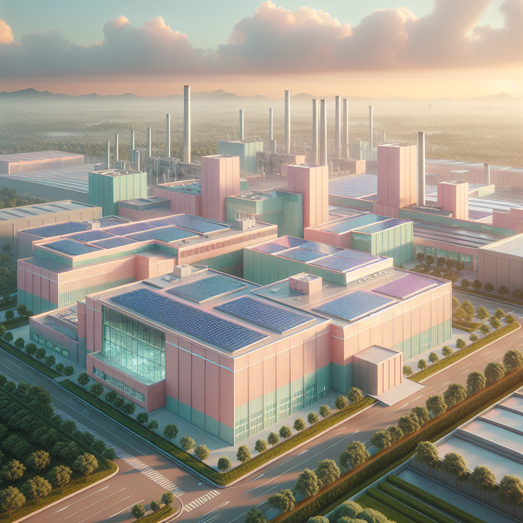
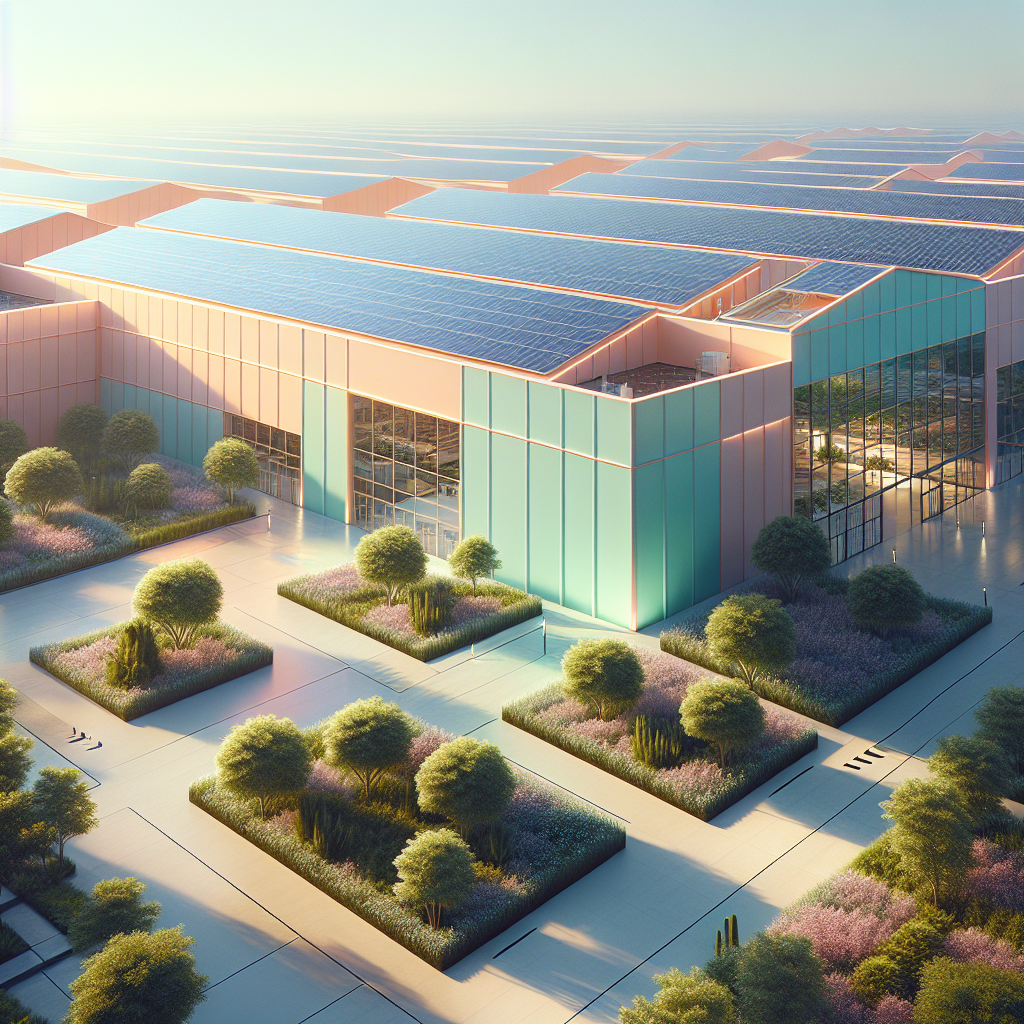
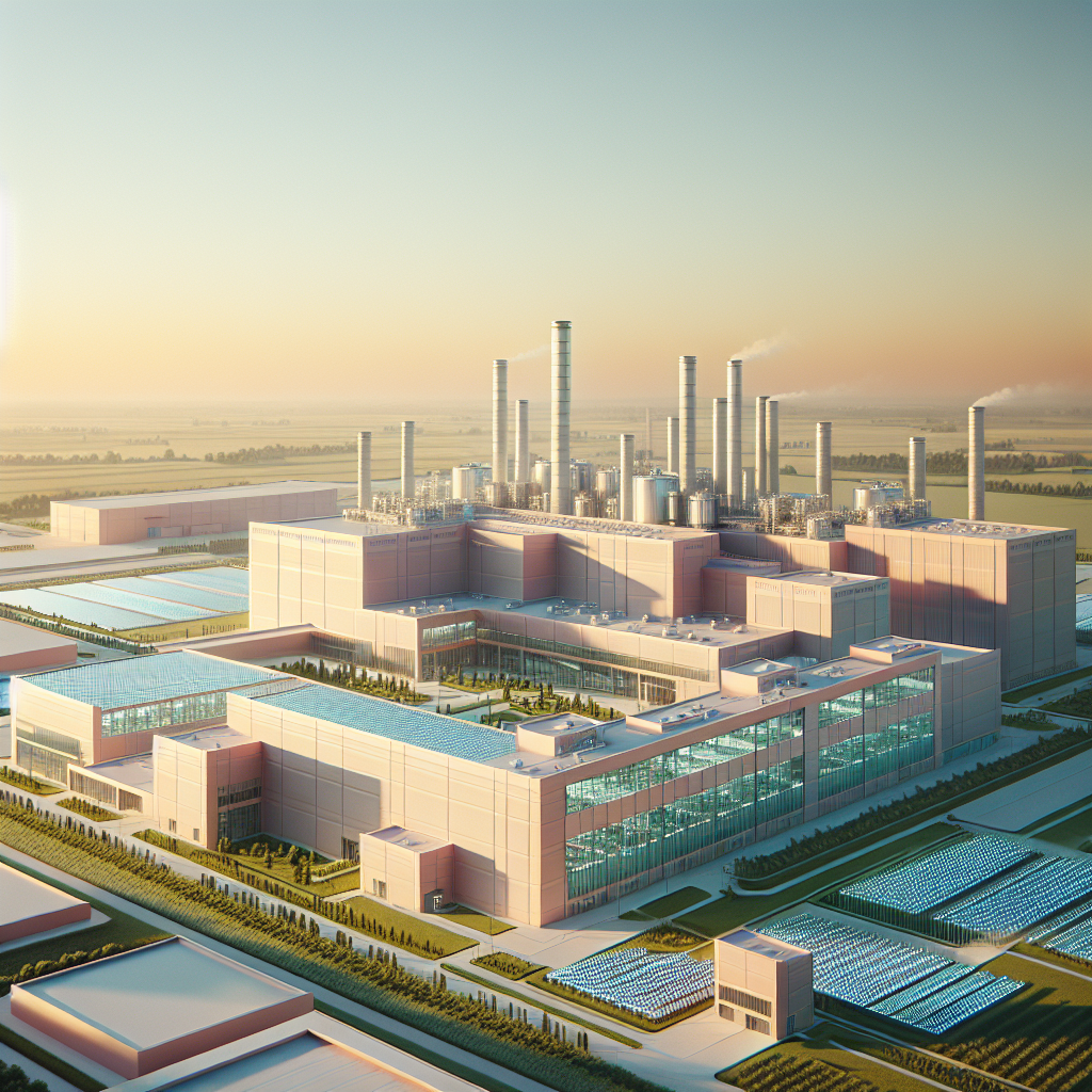
Factories have long symbolized efficiency and output, not beauty. Yet, as industries embrace transparency and sustainability, their architecture is evolving to reflect openness and optimism. The pastel palette—once reserved for domestic interiors or boutique branding—has migrated into the industrial landscape. The result is a surreal juxtaposition: heavy machinery framed by baby blue walls, or solar panels glinting above a peach-toned façade.
Architectural studios such as BIG and Snøhetta have explored color as a tool for emotional engagement in industrial design. According to the ArchDaily editorial team, color psychology in architecture is increasingly being leveraged to humanize spaces that were once purely functional. In pastel factories, color softens the mechanical edge, transforming production into performance.
From Brutalism to Blush
The pastel factory movement can be seen as a counterpoint to the resurgence of Brutalist architecture. Where Brutalism celebrates raw materiality and structural honesty, Cotton Candy Industrial introduces emotional tactility. Concrete remains, but it’s now tinted with warmth—rose quartz replacing cold gray, buttercream replacing steel blue. The result is a form of “soft industrialism,” a design language that tempers power with playfulness.
Some architects trace this aesthetic shift to the influence of digital culture. Instagrammable color gradients and vaporwave nostalgia have made pastel tones synonymous with futurism. The industrial sector, once resistant to aesthetic trends, is now embracing this visual vocabulary to attract younger talent and communicate environmental responsibility.
Color as Sustainability Strategy
Beyond aesthetics, color has a pragmatic role. Light-reflective pastel coatings can reduce heat absorption, improving energy efficiency in large industrial complexes. According to research from the Materials Today Journal, surface color can influence thermal performance by up to 20 percent in high-sunlight regions. This makes pastel façades not just charming, but climatically intelligent.
These chromatic choices align with the broader movement toward net-zero energy architecture. By integrating color with material science, designers are creating factories that both delight the eye and reduce environmental impact. The pastel revolution, then, is not frivolous—it’s functional optimism.
Factories as Community Icons
In cities like Copenhagen and Seoul, pastel-toned factories are becoming landmarks in their own right. Their soft hues contrast with the steel and glass monotony of surrounding business districts, inviting the public to reimagine industry as part of civic life. This mirrors the ethos of adaptive reuse—transforming utilitarian structures into cultural assets.
Some municipalities have even begun integrating pastel industrial zones into urban regeneration projects. The idea is to dissolve the psychological barrier between production and public space. Factories are no longer hidden behind fences; they’re celebrated as part of the urban fabric, complete with visitor centers, rooftop gardens, and educational programs.
The Emotional Geometry of Work
Inside these pastel factories, design continues to challenge expectations. Interiors are often flooded with natural light, with color-coded zones delineating workflow. A mint-green assembly line might signal calm precision, while a coral-toned packaging area encourages energy and focus. The chromatic hierarchy helps workers navigate space intuitively, enhancing both safety and morale.
According to the American Institute of Architects, color and spatial design directly influence worker well-being and productivity. The pastel factory, therefore, becomes a microcosm of humane industrialism—an environment where design supports both output and emotion.
Soft Power, Hard Edges
Not all critics are convinced. Some argue that pastel industrialism risks aestheticizing labor, masking the realities of production behind a photogenic façade. Yet, others see it as a necessary evolution—an acknowledgment that beauty and industry need not be opposites. The pastel factory is, in essence, a visual metaphor for transformation: the hard edges of industry softened by cultural sensitivity.
In this sense, Cotton Candy Industrial aligns with broader trends in sustainable and emotional design. It echoes the principles of biophilic design, which integrates natural forms and colors to enhance human experience. The pastel palette, though synthetic, evokes serenity and balance—qualities often absent from industrial environments.
Global Case Studies
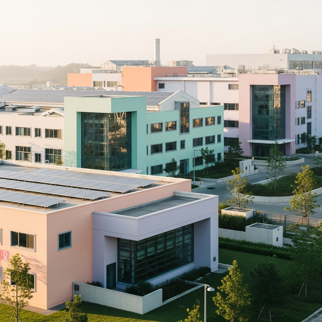
In Osaka, a confectionery factory designed by Nendo features a façade of gradient pinks that fade into cream, echoing the brand’s signature sweets. In Sweden, a textile mill has been reimagined in soft lilac tones, its roof covered in solar panels that shimmer like spun sugar. Meanwhile, in Mexico City, a recycling plant sports a mint-green exterior, signaling its eco-conscious mission.
These examples demonstrate how color can communicate values—sustainability, transparency, creativity—without a single word. The pastel factory becomes a brand statement in itself, merging architecture and identity.
The Future of Industrial Aesthetics
As industries continue to decentralize and digitize, the physical spaces of production are being redefined. The pastel trend may soon extend beyond factories to logistics hubs, data centers, and energy facilities. Imagine a wind turbine painted in gradient peach or a server farm wrapped in powder blue—a future where infrastructure itself becomes art.
In a world grappling with climate anxiety and technological acceleration, Cotton Candy Industrial offers a visual antidote. It suggests that progress can be gentle, that productivity can coexist with poetry. The pastel factory is not a fantasy—it’s a promise that even the hardest industries can dream in color.
###ARTICLE_END### { “seo_title”: “Cotton Candy Industrial Trend”, “meta_description”: “Explore the Cotton Candy Industrial trend—pastel-colored factories redefining industrial design and sustainability.”, “excerpt”: “Pastel-colored factories are transforming industrial architecture, blending sustainability, emotion, and design innovation.”, “focus_keyphrase”: “Cotton Candy Industrial” } **AI Image Prompts** 1. **Prompt:** A pastel pink and mint-green factory exterior under soft morning light, surrounded by minimalist landscaping, shot on a Hasselblad H6D, ultra-realistic industrial photography. **Alt text:** Pastel pink and mint-green factory exterior under morning light. **Caption:** A new era of industry—where production meets pastel serenity. 2. **Prompt:** Interior of a pastel-colored manufacturing space with coral machinery and lavender walls, natural light streaming through skylights, Hasselblad H6D detail shot. **Alt text:** Coral and lavender pastel factory interior with skylights. **Caption:** Inside the Cotton Candy Industrial revolution—color as calm efficiency. 3. **Prompt:** Aerial view of a pastel blue and peach-toned industrial complex with solar panels, surrounded by greenery, photographed with a Hasselblad drone setup. **Alt text:** Aerial view of pastel industrial complex with solar panels. **Caption:** Sustainability meets softness—pastel tones reflecting eco-conscious design. 4. **Prompt:** Workers in pastel uniforms operating machinery in a mint and cream-toned production hall, realistic lighting and composition, Hasselblad H6D. **Alt text:** Workers in pastel uniforms inside mint and cream-toned factory. **Caption:** Humanizing industry—pastel design enhancing workplace well-being. — **Instagram Strategy** **Main Post Caption:** Factories, but make them pastel. 🌸 The Cotton Candy Industrial trend is transforming the way we see production—soft hues, sustainable design, and emotional architecture redefining the industrial landscape. Would you work in a mint-green factory? 👉 Tap the link in bio to explore the full story on Mainifesto.com. **Hashtags:** #CottonCandyIndustrial #PastelArchitecture #IndustrialDesign #SustainableArchitecture #ColorInDesign #ModernFactories #DesignInnovation #EmotionalArchitecture #UrbanAesthetics #PastelTrend #EcoDesign #CreativeIndustry #DesignForWellbeing #FutureOfWorkspaces #MainifestoDesign **Reel Strategy:** Narrative overlays for four scenes: 1. *“Factories are no longer gray.”* – aerial pastel factory shot. 2