Color Psychology in Home Decor: Shades That Boost Mood
Color Psychology in Home Decor: Shades That Boost Mood
Color has always been more than an aesthetic choice—it is a silent architect of mood, behavior, and perception. In the realm of interior design, color psychology has emerged as a powerful tool, shaping not only how spaces look but also how they feel. For design professionals and discerning homeowners alike, understanding the psychological impact of color is no longer optional; it is a strategic necessity. From the serene blues of a minimalist bedroom to the energizing yellows of a contemporary kitchen, the shades we choose are as critical as the materials, textures, and forms that define a space.
The Science of Color Psychology in Interiors
Color psychology is the study of how hues influence human emotions and behaviors. Research has shown that certain colors can lower stress, enhance creativity, or even stimulate appetite. For instance, studies in color psychology demonstrate that warm tones such as red and orange can increase energy levels, while cooler tones like blue and green are associated with calmness and focus. In architecture and interior design, these insights are increasingly applied to create environments that align with human well-being, productivity, and lifestyle needs.
Brands, architects, and interior designers are embracing this knowledge to curate spaces that are not only visually compelling but also emotionally intelligent. This trend aligns with the growing emphasis on biophilic design, where natural elements and colors are used to enhance mental health and well-being.
Shades That Elevate Mood
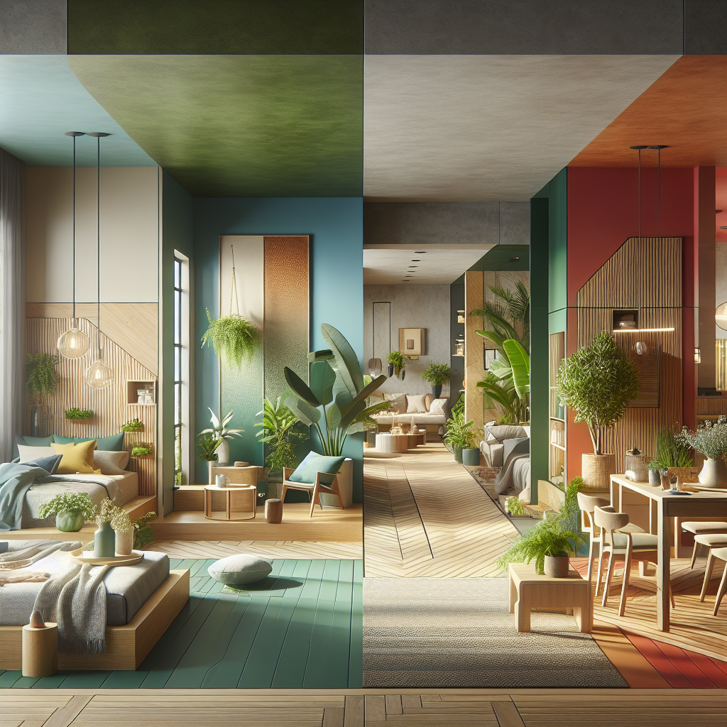
Blue: The Architect of Calm
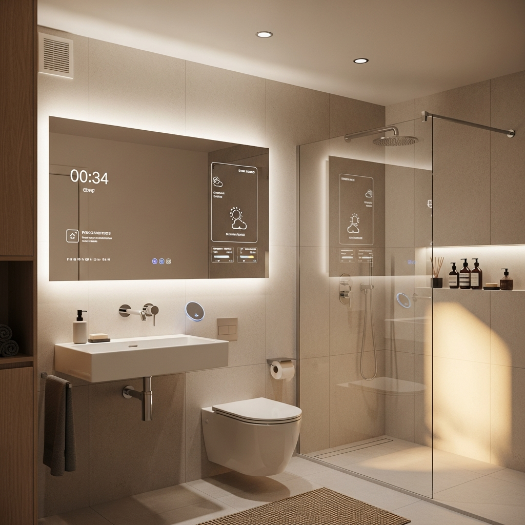
Blue is often considered the most universally calming color. It evokes the serenity of the ocean and the sky, making it a popular choice for bedrooms, bathrooms, and meditation spaces. Deep navy tones paired with natural materials such as oak or walnut create a sophisticated retreat, while lighter sky blues can expand small spaces, enhancing their sense of openness. Designers frequently use blue in wellness-focused interiors, where tranquility is paramount.
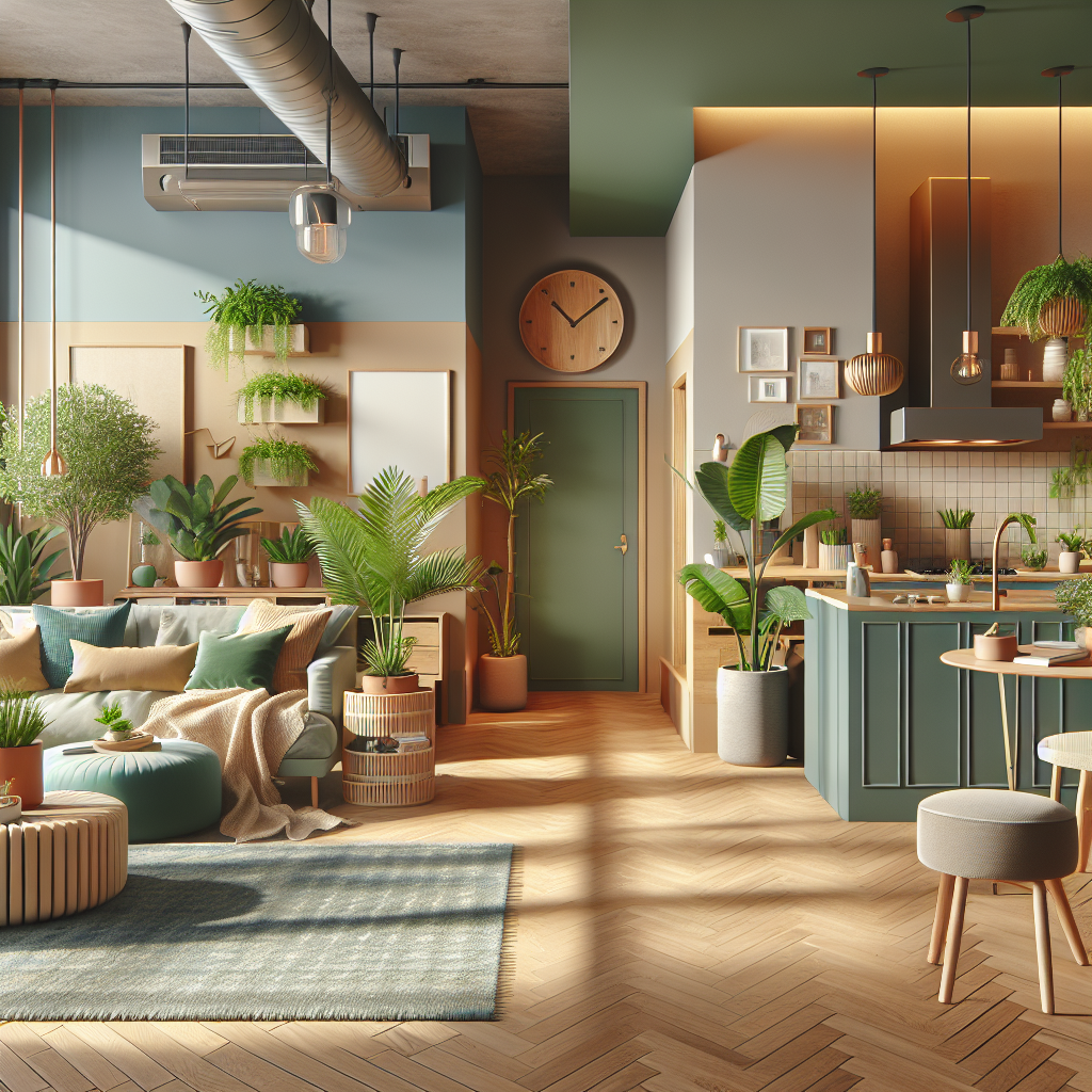
Green: The Restorative Hue
Green, associated with nature and renewal, is a cornerstone of restorative design. According to color theory, green balances warm and cool tones, making it one of the most versatile shades in interiors. From sage to emerald, green promotes relaxation and has been shown to reduce anxiety. Its popularity has surged in urban homes, where residents crave a connection to nature. Vertical gardens, moss walls, and green-toned textiles bring this biophilic palette indoors, reinforcing the human-nature bond.
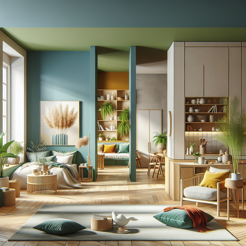
Yellow: The Optimist’s Palette
Yellow is the color of optimism, energy, and warmth. It is particularly effective in kitchens, dining areas, and creative studios, where stimulation and positivity are desired. While bold, saturated yellows can be overwhelming, muted ochres and buttery pastels offer a refined approach. In contemporary design, yellow is often used as an accent—through statement chairs, lighting fixtures, or ceramics—to inject vibrancy without overpowering the space.
Red: The Energizer
Red is a color of passion and intensity. In residential interiors, it is best used sparingly, as an accent in dining rooms or social spaces where energy and conversation are encouraged. Paired with tactile materials such as velvet or leather, red exudes luxury and drama. In contrast, terracotta and brick reds, rooted in earthy tones, bring warmth and grounding to living spaces, aligning with the current resurgence of chromatic harmony in architectural design.
Neutrals: The Silent Mood Shapers
While bold colors often steal the spotlight, neutrals—beige, taupe, ivory, and soft greys—are essential in creating balance. They provide a canvas upon which accent colors can shine, while also offering a sense of stability and timelessness. Neutrals are particularly effective in open-plan living, where they unify diverse zones without overwhelming the senses. The rise of minimalist chic interiors has reaffirmed the importance of neutral palettes in cultivating calm, uncluttered environments.
Color Psychology Meets Contemporary Trends
In recent years, the intersection of color psychology and sustainability has become increasingly significant. Designers are turning to natural pigments, recycled materials, and earth-inspired palettes to create interiors that are both emotionally resonant and environmentally responsible. This movement parallels the architectural rise of timber in high-rise construction, where material choices reflect both ecological and aesthetic considerations.
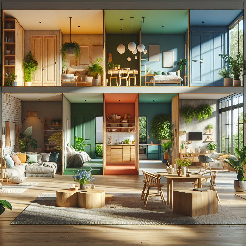
Another emerging trend is the use of color zoning—employing different hues to define functional areas within open-plan layouts. For example, a calming sage green may delineate a reading nook, while a vibrant coral marks a dining space. This technique not only enhances spatial organization but also reinforces the psychological impact of color in daily routines.
Case Studies: Color as a Design Strategy
One striking example is the use of muted blues and greens in Scandinavian-inspired interiors, where simplicity and serenity are central. These shades are often paired with natural light and raw materials, creating spaces that feel both expansive and intimate. In contrast, Mediterranean interiors frequently embrace terracotta, mustard, and cobalt, evoking warmth and vibrancy while reflecting cultural heritage.
Luxury hospitality design also offers compelling case studies. High-end hotels often employ color psychology to curate guest experiences: deep indigos in spa areas to encourage relaxation, golden hues in lobbies to suggest opulence, and soft blush tones in suites to create intimacy. These choices are never arbitrary; they are carefully calibrated to align with brand identity and guest expectations.
Designing with Intention: Practical Insights
For architects and interior designers, the challenge lies in balancing aesthetic ambition with psychological impact. A few guiding principles can elevate the practice:
- Contextual Relevance: Consider cultural associations of color. For instance, while white symbolizes purity in Western contexts, it is associated with mourning in parts of Asia.
- Material Synergy: Colors interact with textures and finishes. A matte sage wall will evoke a different mood than a glossy emerald tile.
- Lighting Matters: Natural and artificial lighting dramatically alter color perception. Warm lighting can soften stark whites, while cool lighting can intensify blues.
- Balance and Restraint: Overuse of bold colors can overwhelm. Strategic accents often achieve greater impact than saturation.
The Future of Color in Home Design
As our homes increasingly double as workplaces, sanctuaries, and social hubs, the role of color psychology will only deepen. The future points toward more personalized palettes, enabled by digital visualization tools and AI-driven design platforms. Clients are no longer content with trend-driven hues; they seek colors that resonate with their emotional needs and lifestyle rhythms.
Moreover, as sustainability continues to shape design, we can expect a growing emphasis on natural, non-toxic pigments and palettes inspired by ecological landscapes. This evolution mirrors broader shifts in architecture, where green architecture and biophilic principles are redefining the relationship between built environments and human well-being.
Final Thoughts
Color is not mere decoration—it is a profound design instrument that shapes human experience. For architects and interior designers, mastery of color psychology is as essential as understanding form, proportion, or materiality. By choosing shades that align with emotional well-being, designers can craft interiors that do more than please the eye; they nurture the mind and soul. In a world where the home has become the epicenter of life, color is the invisible yet powerful force that transforms space into sanctuary.