Bold pastel illusions: bridging retro flamboyance and futuristic décor
Bold Pastel Illusions: Bridging Retro Flamboyance and Futuristic Décor
In the ever-evolving world of interior design, color has re-emerged as a powerful narrative tool—one that transcends mere aesthetics to shape emotion, identity, and even spatial perception. The latest evolution in this chromatic renaissance is the rise of bold pastel illusions: a design language that fuses the nostalgic exuberance of mid-century palettes with the sleek, high-tech sensibilities of tomorrow’s interiors. It’s a movement that celebrates contradiction—soft yet daring, retro yet forward-looking—and it’s redefining how designers conceive of color as architecture.
The New Chromatic Frontier
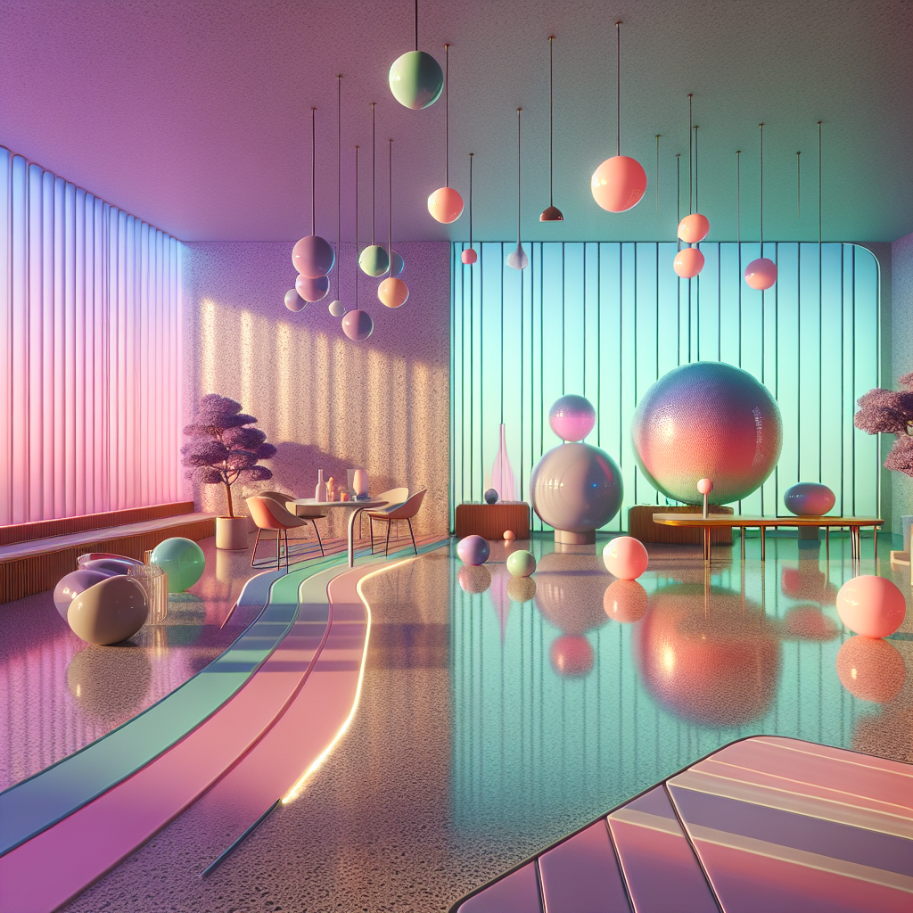
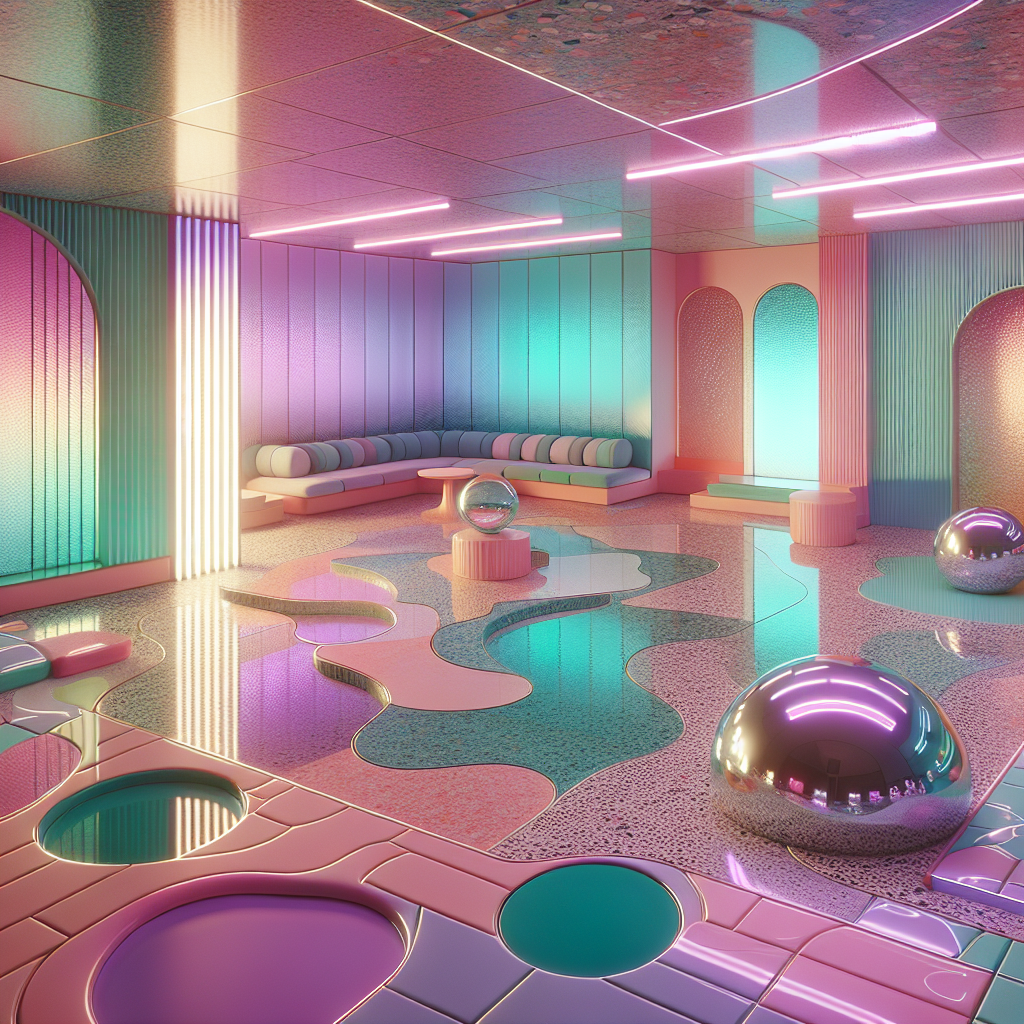
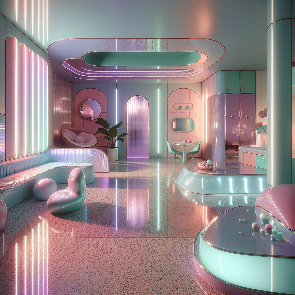
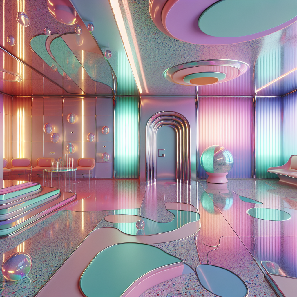
Pastels, once confined to the polite serenity of suburban kitchens or 1980s Miami interiors, are now being reimagined as dynamic, spatially active elements. The contemporary pastel is not about sweetness—it’s about optical tension. Designers are experimenting with gradients, reflective finishes, and lighting technologies that make these hues shimmer, shift, and pulse. The result is an illusionary interplay between material and light that evokes both nostalgia and futurism.
This trend resonates with the growing appetite for chromatic experimentation in architectural design. The palette of soft lilacs, mint greens, and blush corals is being amplified through iridescent coatings, dichroic glass, and LED backlighting—creating spaces that appear to morph with the viewer’s movement. The illusion is deliberate: a pastel that behaves like neon, a color that breathes.
Retro Flamboyance Reimagined
The resurgence of pastel flamboyance owes much to the revival of postmodern and Memphis influences. Designers such as Ettore Sottsass once used color as rebellion—a joyful antidote to modernist austerity. Today’s creators are channeling that same irreverence but with a technological twist. Instead of lacquered laminates and plastic veneers, we see bioplastic composites, 3D-printed ceramics, and responsive surfaces that reinterpret the exuberance of the 1980s for a digital age.
A striking example is the recent transformation of boutique hotels in Copenhagen and Tokyo, where designers employ candy-colored terrazzo floors, holographic wall panels, and curved furniture silhouettes reminiscent of vintage diners. Yet, these interiors are not nostalgic replicas—they are temporal hybrids, where the past and future coexist in pastel light. The illusion of depth, achieved through layered translucency and mirrored surfaces, makes each space feel simultaneously intimate and infinite.
This chromatic audacity aligns with the ethos of Memphis revival design, which continues to influence both furniture and lighting industries. By merging playful geometry with advanced materials, designers are crafting interiors that feel both cinematic and tactile—spaces that invite interaction rather than passive admiration.
Technology and the Pastel Illusion
The futuristic dimension of bold pastels lies in their relationship with light and perception. As smart lighting systems and responsive materials become integral to interior architecture, color is no longer static. It reacts, adapts, and transforms. The pastel illusion thrives in this context—its softness becomes a canvas for technological dynamism.
Recent innovations in augmented reality design and projection mapping allow walls to shift hues in real time, creating immersive chromatic experiences. Imagine a living room that transitions from a serene lavender dawn to a warm coral dusk, guided by circadian lighting algorithms. These adaptive environments are not just aesthetic experiments—they’re wellness-oriented, aligning with research from the psychology of color that links specific hues to mood regulation and cognitive balance.
Moreover, pastel illusions are increasingly being integrated into sustainable design strategies. By using reflective coatings and color-responsive materials, architects can manipulate natural light to reduce energy consumption. A blush-toned façade, for instance, can subtly shift its reflectivity throughout the day, enhancing thermal comfort while maintaining visual harmony. This intersection of eco-consciousness and aesthetic delight marks a new chapter in design innovation.
Material Alchemy: From Matte to Mirage
Materiality plays a pivotal role in the success of pastel illusions. Designers are moving beyond paint and pigment, exploring how surfaces themselves can embody color. Polished concrete infused with mica, resin panels embedded with iridescent particles, and translucent onyx illuminated from within—all these materials create depth through diffraction. The result is a pastel that feels alive, a hue that seems to breathe with the architecture.
This tactile dimension echoes the growing fascination with imperfection and texture in contemporary interiors. When combined with soft color gradients, rough materials like lime plaster or brushed aluminum acquire a poetic duality—both raw and refined. The pastel illusion, then, becomes not just a visual phenomenon but a sensory one, inviting touch, reflection, and emotional engagement.
Case Studies: Spaces That Blur Time
In Milan’s Brera Design District, a recent exhibition titled “Illusory Horizons” showcased installations where pastel light refracted through layered glass created dreamlike corridors. Visitors described the experience as “walking through a memory of the future.” Similarly, in Los Angeles, a private residence designed by Studio Kozo features a gradient façade that transitions from pale peach to icy blue depending on the sun’s angle—an architectural embodiment of temporal fluidity.
Retail spaces are also embracing this trend. Brands seeking to attract younger, digitally native consumers are turning to color illusions as storytelling devices. A flagship store in Seoul, for instance, uses thermochromic tiles that shift from mint to rose when touched, merging sensory play with emotional branding. The space feels both nostalgic and futuristic—like stepping into a holographic dreamscape.
The Psychology of Soft Power
The appeal of bold pastels lies in their psychological balance. They offer a reprieve from the visual noise of urban life while maintaining a sense of optimism and vitality. According to a 2025 study by the Pantone Color Institute, pastel tones are increasingly associated with “digital serenity”—a counterpoint to the overstimulation of screen-based environments. In this sense, pastel illusions serve as a design antidote to digital fatigue, offering spaces that soothe without dulling the senses.
This aligns with the principles of biophilic design, which emphasizes the emotional and physiological benefits of natural light, color, and texture. By integrating soft chromatic transitions and reflective materials, designers can mimic the subtle dynamism of nature—sunlight filtering through leaves, water reflecting the sky—within built environments.
From Domestic Interiors to Urban Landscapes
The influence of bold pastel illusions is extending beyond interiors into urban architecture. Facades in cities like Lisbon, Tokyo, and Melbourne are adopting gradient finishes and color-shifting panels that respond to environmental conditions. These interventions transform skylines into living canvases, challenging the dominance of neutral minimalism that has characterized the past two decades.
In this context, pastel illusions become a form of urban storytelling—a way to humanize technology-driven cities. They invite interaction, reflection, and joy. As one architect noted during the 2025 Venice Architecture Biennale, “Color is no longer decoration; it’s dialogue.”
Designing the Future in Soft Focus
The rise of bold pastel illusions signals a broader cultural shift toward emotional futurism—a design philosophy that values sensory depth as much as technological progress. It’s a reminder that the future need not be sterile or monochrome. Instead, it can be radiant, tender, and inclusive.
For designers and architects, this movement offers fertile ground for experimentation. Whether through iridescent façades, responsive lighting, or gradient ceramics, the challenge lies in crafting spaces that feel simultaneously familiar and otherworldly. The pastel illusion is not a fleeting trend—it’s a visual manifesto for balance: between nostalgia and innovation, softness and strength, humanity and technology.
In the age of digital acceleration, these chromatic spaces whisper a gentle provocation: the future can be bold without being loud, and color—when wielded with intelligence and empathy—can bridge time itself.
Published on 01/05/2026
Get the Mainifesto weekly — curated design debates, speculative ideas and the week's best articles every Saturday.