Whimsical minimalism playful: color blocks integrated into stark environments
Whimsical Minimalism Playful: Color Blocks Integrated into Stark Environments
Minimalism has long been synonymous with restraint, austerity, and purity of form. Yet, in recent years, a new current has emerged within this design ethos—one that embraces playfulness, whimsy, and bold chromatic interventions. Architects and interior designers are increasingly experimenting with color blocking as a counterpoint to stark, pared-down environments. The result is a dialogue between silence and exuberance, neutrality and vibrancy, precision and spontaneity. This trend—best described as whimsical minimalism—is redefining how we perceive and inhabit space.
The Rise of Color Blocking in Minimalist Architecture
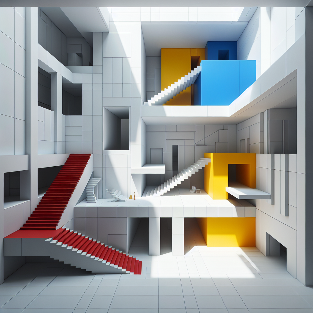
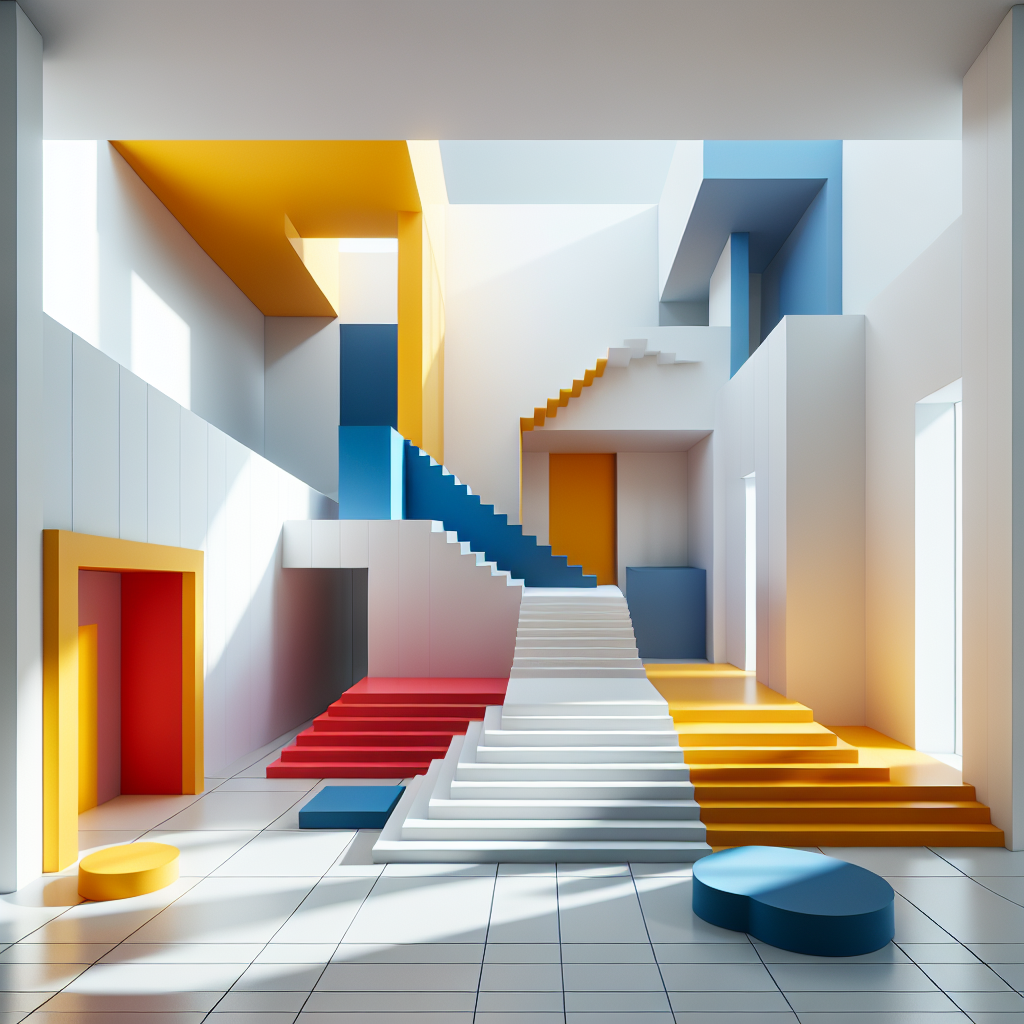
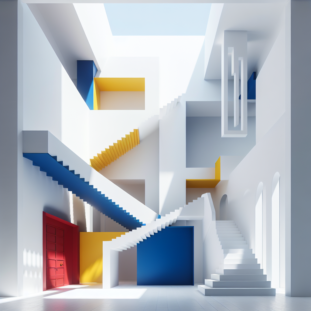
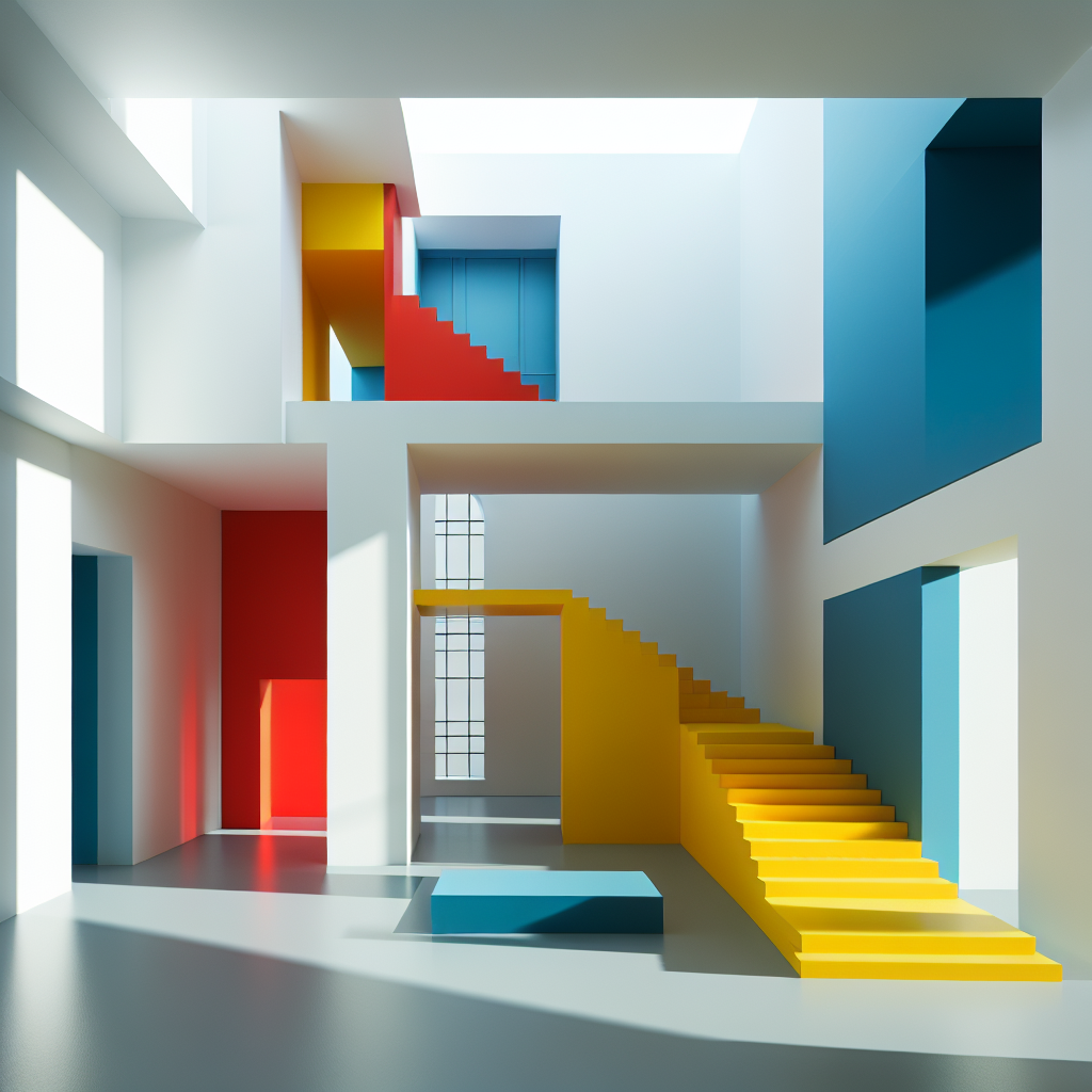
Color blocking, a technique with roots in early 20th-century art movements such as De Stijl and Bauhaus, has resurfaced as a potent tool in contemporary design. While minimalism traditionally relied on monochrome palettes and natural materials, today’s practitioners are punctuating these restrained backdrops with bold geometric swaths of color. These interventions are not mere decorative flourishes; they serve as spatial anchors, wayfinding devices, and emotional cues within otherwise stark environments.
In the context of urban architecture, color blocking is often deployed to break the monotony of concrete expanses. A single vermillion staircase slicing through a white atrium, or a cobalt-blue volume embedded within a glass façade, can radically alter the perception of scale and movement. As seen in projects like the Luis Barragán House in Mexico City—where vibrant planes of pink, yellow, and blue animate minimalist geometries—color becomes both structure and atmosphere.
Playfulness as a Counterbalance to Restraint
Minimalism’s rigor can sometimes verge on sterility. The introduction of playful color blocks disrupts this severity, injecting human warmth and emotional resonance. In interiors, designers are using primary hues and saturated tones to carve out zones of activity, intimacy, or reflection. A lemon-yellow alcove might signal a reading nook, while a magenta wall could delineate a social gathering space within an otherwise neutral open-plan layout.
This interplay is particularly evident in residential projects where the demand for minimalist chic coexists with the desire for comfort and personality. The result is a form of design that is both disciplined and joyful—an antidote to the monochrome fatigue that has permeated much of contemporary minimalism.
Case Studies: Color as Spatial Strategy
1. The Memphis Revival
The resurgence of Memphis-inspired color blocking in contemporary showrooms demonstrates how bold chromatic interventions can coexist with clean-lined architecture. Designers are using oversized geometric patterns in contrasting hues to create a sense of theatricality within otherwise restrained spaces. The effect is playful yet controlled, evoking nostalgia while pushing minimalism into new territory.
2. Japanese Capsule Hotels
In Japan, capsule hotels—renowned for their minimalist efficiency—have begun integrating vibrant accent colors into their micro-living environments. A corridor lined with alternating blocks of crimson and teal transforms what could be a monotonous passage into a rhythmic, almost cinematic experience. This design approach aligns with the principles of Japanese minimalism, where simplicity is balanced with moments of surprise.
3. Public Installations
Public art and architectural installations are also embracing color blocking as a way to activate civic spaces. Projects like the Serpentine Pavilion in London have experimented with chromatic planes that invite interaction, photography, and play. In this sense, color becomes a democratic tool—accessible, legible, and emotionally engaging for diverse audiences.
The Psychology of Color in Minimalist Spaces
Color psychology plays a crucial role in the effectiveness of whimsical minimalism. Research has shown that color influences mood and behavior, with warm tones stimulating energy and cool hues promoting calm. When integrated into minimalist environments, these effects are amplified by contrast. A single block of red in a white gallery can heighten alertness, while a patch of turquoise in a concrete courtyard can evoke serenity.
Designers are increasingly aware of these dynamics, using color not just for visual impact but as a functional tool for well-being. This aligns with broader movements in design, such as biophilic design, which prioritize human health and emotional connection within built environments.
Materiality and Technology: Expanding the Palette
The integration of color blocks into stark environments is not limited to paint or pigment. Advances in materials and fabrication have expanded the possibilities for chromatic expression. Laminated glass panels, powder-coated metals, and digitally printed ceramics allow for durable, luminous, and highly customizable applications of color. In some cases, architects are experimenting with thermochromic and light-reactive surfaces that shift hues depending on temperature or daylight conditions, adding a kinetic dimension to color blocking.
Digital tools such as parametric design also enable designers to integrate color into complex geometries, ensuring that chromatic interventions are not superficial but embedded into the very logic of the structure.
Whimsical Minimalism in the Context of Sustainability
While color blocking may appear purely aesthetic, it intersects with sustainability in subtle ways. By strategically using color to define zones and enhance perception, designers can reduce the need for physical partitions, thus minimizing material consumption. Moreover, vibrant accents can extend the perceived lifespan of minimalist interiors, making them feel less austere and more adaptable to evolving tastes.
This approach resonates with the growing emphasis on circular economy design, where longevity and adaptability are key. Whimsical minimalism demonstrates that sustainability need not be synonymous with monotony; it can be both responsible and exuberant.
Future Directions: Toward Experiential Minimalism
As we move deeper into the 2020s, whimsical minimalism is poised to become a defining language of contemporary design. The trend reflects a broader cultural shift toward experiential environments—spaces that are not only functional and efficient but also emotionally resonant and memorable. In this context, color blocking acts as a catalyst for engagement, encouraging occupants to pause, interact, and delight in their surroundings.
For architects and designers, the challenge lies in balancing restraint with exuberance, ensuring that color interventions feel intentional rather than arbitrary. When executed with precision, whimsical minimalism can transform stark environments into living canvases—spaces where geometry, light, and color converge in playful harmony.
Final Thoughts
Whimsical minimalism represents a refreshing evolution of the minimalist ethos. By integrating bold color blocks into stark environments, designers are crafting spaces that are both rigorous and joyful, serene yet stimulating. This design language acknowledges the human need for both clarity and play, restraint and delight. In doing so, it charts a path forward for minimalism—one that is less about austerity and more about human-centered vibrancy.
Get the Mainifesto weekly — curated design debates, speculative ideas and the week's best articles every Saturday.